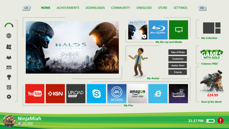
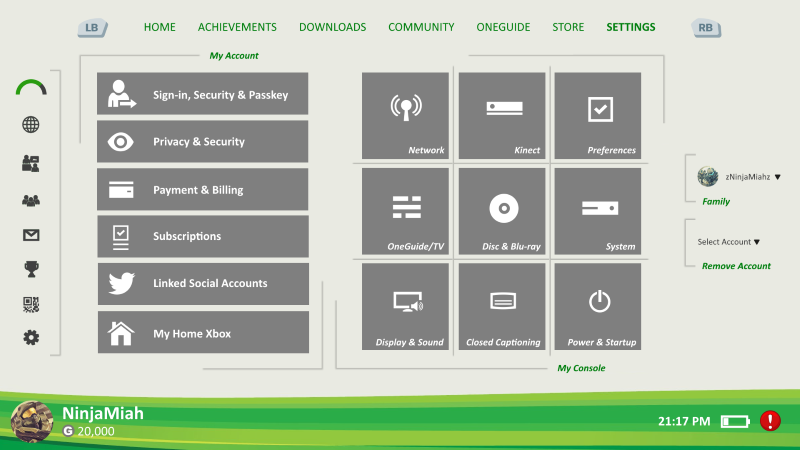
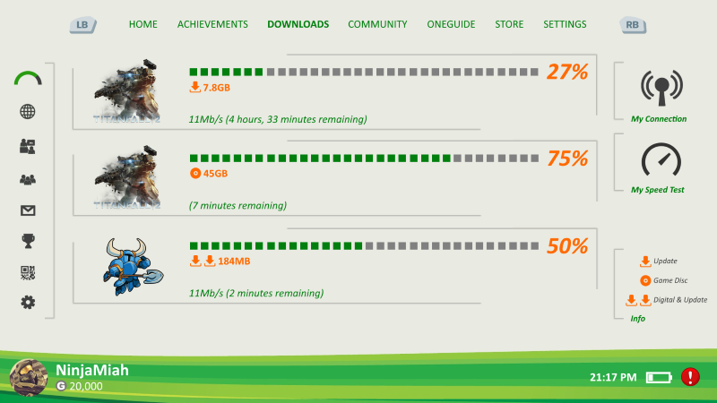
Microsoft Xbox One Dashboard [Concept]

Avatar image for shaymiah1986
shaymiah1986

3

Forum Posts

0

Wiki Points

0

Followers

Reviews: 0

User Lists: 0

#1  Edited By shaymiah1986
Member since 2016 • 3 Posts

Hey peeps!

My first post here so go easy on me. In my free time I done some graphic design of the Xbox One dashboard. I ain't a professional graphic designer but I just used basic Microsoft Paint and Paint.NET apps on Windows 10. Images, logos etc I used from the internet (the power of Google).

At the moment I ain't a fan of the official dashboard on the Xbox One. To me it looks dull and boring and it ain't snappy aka super fast. I have Tweeted my design to Phil Spencer (would he like the design?). So below is my concept of the Xbox One dashboard, feel free to post your comments.
The boot-up. Maybe add during boot-up on bottom left corner; 10% Master Chief Awakens, 25% Master Chief Initialising Core Components etc
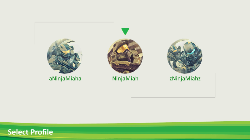
Select profile. That's my profile in the middle, feel free to add me on Xbox. The other profiles on left/right I made up just to give idea profiles will be alphabetically sorted.
Home. Left side has reputation bar, redeem code for easier access. Bottom right corner red notification for Xbox Live Service alerts which can be selected and more information given. Can be amber or green to indicate status.
Settings
Settings
Downloads. Supports multiple downloads along with installation from game disc.

Avatar image for suicidesn0wman
suicidesn0wman

7490

Forum Posts

0

Wiki Points

0

Followers

Reviews: 10

User Lists: 0

#2 suicidesn0wman
Member since 2006 • 7490 Posts

Looks more like a design for the 360 dash. I'd also say it is too cluttered, modern design is trending toward larger containers with plenty of spacing for ease of use/readability. Cramming as much junk in a small space as possible simply doesn't cut it.

It's decent for a first attempt, especially with terrible tools.

Avatar image for deactivated-5eb6f92daae05
deactivated-5eb6f92daae05

916

Forum Posts

0

Wiki Points

0

Followers

Reviews: 0

User Lists: 0

#3 deactivated-5eb6f92daae05
Member since 2015 • 916 Posts

It's pretty good for your 1st attempt man. A lot better than what I can do with it...lol. My opinion, simple is better and less is more. So maybe take the blades dashboard from how it was originally on the Xbox 360 and add a modern touch to that?

Avatar image for oflow
oflow

5185

Forum Posts

0

Wiki Points

0

Followers

Reviews: 40

User Lists: 0

#4 oflow
Member since 2003 • 5185 Posts

All they have to do is make the Xbox One on screen dashboard look exactly like the Xbox App dashboard and it would be great.

Avatar image for redskins4045
Redskins4045

108

Forum Posts

0

Wiki Points

0

Followers

Reviews: 55

User Lists: 0

#5 Redskins4045
Member since 2015 • 108 Posts

Looks great to me. Nice job bud! I don't mind so called a "cludered" dashboard since I know what and where everything will be. A lot of people I know like PS4's better bc it's more user friendly for the people who aren't intelligent enough to run a elaborate dashboard.