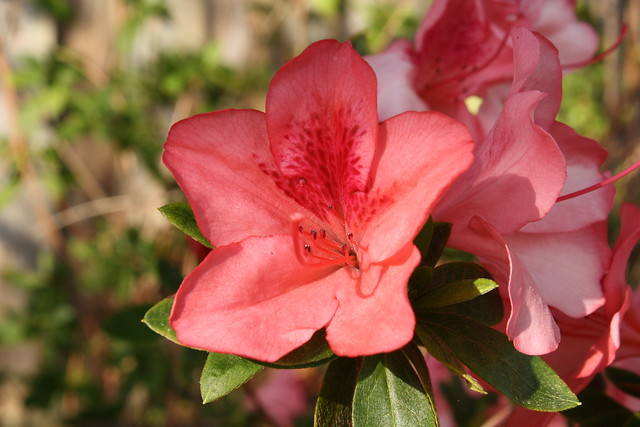
#1) Pretty good. But I think one of the most important things is to really narrow down on what a picture is ABOUT. It could be about a flower, in which case you'd probably want to get in close, eliminate things which distract from the flower. Alternatively, a picture could be about the relationship between the flower and its environment. In which case you'd probably want to back up, include some of the environment, and provide a bit of extra context relating to the flower.
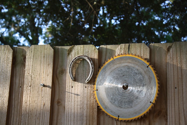
In the first picture you posted, the picture really seems to me to be ABOUT the stuff happening on the fence. I mean...there's some really interesting stuff going on there. You've got a lot of contrast between light and shadow, and the circular objects are really pretty interesting as a stark contrast to the hard lines of the fence. Meanwhile, the trees are blurry and don't really seem to have anything to do with the stuff in the foreground.
There's really some VERY interesting stuff going on there, but this is a case in which I really think it would have been better to get in closer and eliminate the things that aren't really helping. There's a good picture here, but I don't think that the trees are helping. I'd like to see this reshot with the trees totally eliminated from the picture.
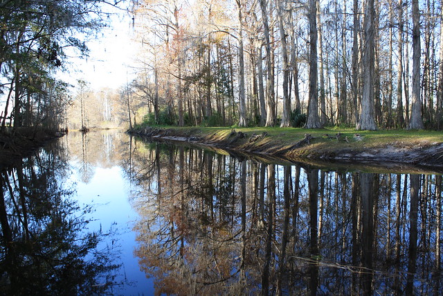
#2) Also a pretty cool picture. One obvious problem is that the horizon line isn't straight. However, that's something which should be able to be fixed pretty easily, so that's not a huge issue. The bigger problem is that the background is just way too overexposed. And the thing about landscape pictures is that for many of those kinds of pictures, you pretty much have to really exclusively on the sun for light. So the kind of problem here is sort of something that often simply can't be fixed without simply waiting until the sun is in a different position. Cool picture, but I think it could be far improved by simply shooting when the light was better.
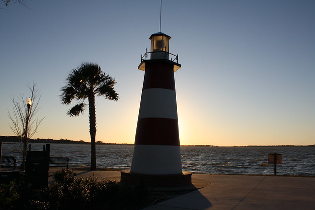
#3) My issue with #3 is sort of a combination of the stuff I just talked about in the previous picture. The picture seems to be primarily ABOUT the lighthouse (as opposed to being about the sky, or being about the stuff next to the lighthouse). The lighthouse is also extremely underexposed. As far as the underexposed lighthouse is concerned, one thing you could do is to simply wait until the sun is in a better position and then take the picture again. Alternatively, you could just increase exposure until the lighthouse is exposed. Even though that would inevitably result in the sky being even brighter (sky would probably be mostly pure white), I think that's a fair trade-off. The picture doesn't really seem to be ABOUT the sky, so I don't see a problem with minimizing the sky's importance. The lighthouse seems to be the most important thing here. And if you can't get EVERYTHING well exposed, then it's probably better to get the lighthouse exposed right even if it's at the expense of other things in the picture.
As far as composition goes, there's also a lot of stuff in the foreground which doesn't really seem to be SAYING anything. The palm tree sort of says something (it's a warm enough climate for palm trees to live) and that sort of gives some information that observers can use. So yeah...keep the tree. But most of the other stuff in the foreground really doesn't seem to be doing anything helpful in my opinion. I'd recommend shooting in vertical (rather than horizontal) orientation, getting in closer, and cutting out a lot of the sky and a lot of the stuff in the foreground. Then maybe rrepositioning yourself until the palm tree and the lighthouse feel like they're well balanced.
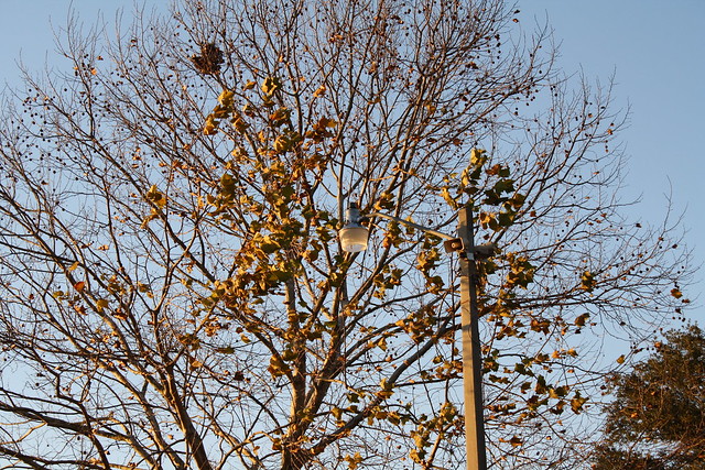
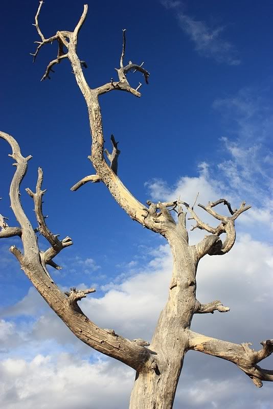
#4) Again, what is this picture about? Is it about the random organic lines present in the tree? I sort of THINK that's the case, because this picture doesn't look as if it's really about the tree in within the context of the environment. There's not really enough environment there to give it context. The only other significant thing there aside from the branches seems to be the light post, and that isn't working for me because it's just sort of merging with the tree. The lighting and the contrast and the color are similar enough that none of the elements (the tree or the pole) really stand out. They just sort of merge together In a way that's not pleasant for me.
So...what is this picture about? Is it about the relationship between the straight vertical lamp post and the random organic lines of the tree? If so, that's a good idea. But I really think that the lighting should be such that the light post doesn't blend in with the tree so much. Honestly, they're just sort of merging together in a really uncomfortable way.
Alternatively, if the picture is about the organic lines of the tree branches, then I think it's be a good idea to get in a lot closer. Cut out the unneeded stuff (like the pole, and the negative space around the tree). Get in really close, and really make the picture ABOUT the organic lines of the tree.
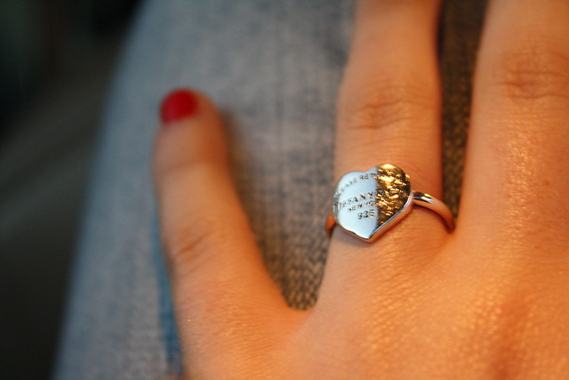
#5) This one is a cool idea. Not really my cup of tea, but I think it's a valid idea. A few things though. It's not sharp enough. The ring seems to absolutely be the most important thing there. So the ring in particular seems like it should be in focus. In fact, NOTHING in that picture seems to be in focus, so that sort of seems like the picture was shot without a tripod, using a shuter speed that was too slow to avoid causing motion blur. Solution...either use a tripod, or shoot at a faster shutter speed.
MrGeezer
First and foremost, I greatly appreciate the feedback on my photos. I always enjoy listening from friends about what they think, and even more so, from people who have an idea of what makes a good photo. Which it sounds like you do. I would rather hear criticism, than compliments. I am always trying to learn how to do better.
The flower photo was taken with my kit lens, as that was the only lens I had at the time. It was certainly hindering just a little bit in macro shots and that was about as close I could get to it without losing focus. I figured, so long as the background was blurred enough, the focus of the photo would stay on the flower and not distract from it.
The photo of the creek, I thought the horizon was fairly straight? Perhaps the reason it looks slightly odd was because the bank on the left was a few feet higher than the right side. I chose that exposure because I liked the color of the sky in the water better than the color of the sky itself. I felt that the bright glow of the sun made it more interesting as well. I agree if I had waited longer for a different time of day, I could have got equal colors from the water and the sky. However, I didn't have a tripod with me, so it would have been hard.
As for the photo of the lighthouse, I wasn't trying to solely focus on the lighthouse. The sun was directly behind the lighthouse almost in the dead center behind it. The point was to get some kind of "haloish" effect from the sun that surrounded the lighthouse, I probably could have done a little better if I took more with different settings. I was still very new and wasn't really sure how to go about it.
The photo of the tree was certainly about the lines of the branches. I agree it probably would have been better if the lamp post wasn't there. At the same time however, perhaps it breaks it up a little. To be honest, I might just be a sucker for that shade of yellow and the contrast of the blue sky behind it.
The photo of the fence, I felt keeping the frame where it was with the trees in the background blurred out enough to keep the focus on the objects on the fence was better than keeping it solely on the fence, because the area below the circular saw was completely shadowed out. I felt it was too bland if I had gotten rid of the trees behind it. The trees are still blurred out enough where I don't believe it distracts from the objects and the fence.
The photo of the ring was taken in a moving vehicle with not a whole lot of lighting, and I rarely use the flash for anything. Even with the blurriness, I still found it appealing.


 [/spoiler]


Log in to comment