Here's the link:
http://gonintendo.com/?p=77963
This topic is locked from further discussion.
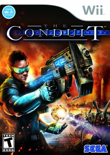
I'll just past the box art.
i don't know what you people are looking at, that's ugly.

[QUOTE="MonsieurX"]Ewwww.Jaysonguy
Yeah, that pretty much sums it up
What's so bad about it? Ford looks awesome, his gun looks awesome, and the burning DC in the background looks awesome! How would you make the boxart?[QUOTE="Jaysonguy"][QUOTE="MonsieurX"]Ewwww.Head_of_games
Yeah, that pretty much sums it up
What's so bad about it? Ford looks awesome, his gun looks awesome, and the burning DC in the background looks awesome! How would you make the boxart?Like the game it's trying to be (the second and third installments or one of the spin offs)
Just as someone said in here, it's got that cheezy "NES Mega Man" look to it
You think it looks too halo-like? What's so wrong with that? Halo was awesome, and I wouldn't at all mind a game of that type on Wii. The point is that this box-art will sell more copies, therefore it is good.Head_of_games
No, I think it doesn't look that way
It looks too NES Mega Man like
Looks like the usual crappy artwork on shovelware trying desperately to lure people to buy it.
I don't think that's the look they were going for
The hell? The box art should be "like the game it's trying to be"? As if this game wasn't about a guy in a special suit shooting aliens against the backdrop of a run-down DC?
Oh wait, it's Jaysonguy. Nevermind, makes sense now, carry on.
[QUOTE="Head_of_games"]You think it looks too halo-like? What's so wrong with that? Halo was awesome, and I wouldn't at all mind a game of that type on Wii. The point is that this box-art will sell more copies, therefore it is good.Jaysonguy
No, I think it doesn't look that way
It looks too NES Mega Man like
Looks like the usual crappy artwork on shovelware trying desperately to lure people to buy it.
I don't think that's the look they were going for
*Googles Mega Man NES cover*

What??? You think it looks like this?! I'm sorry but The Conduit's boxart looks miles better. Like I said before, Ford looks awesome, his gun looks awesome, and the burning city looks awesome. Exactly what is unappealing to you about the boxart, and how would you fix it?
How does it look like mega man? That NES boxart looks like it was made by a five year old! The Conduit: Awesome character with sweet glasses and cool armor. Wicked cool rifle. Burning Washington DC in background. Nice dark atmosphere. Megaman NES: Lame looking ugly character with lousy blue and gold armor. Small pistol. Futuristic city with lame-looking fire. Colorful and poorly drawn. Sure they both have a guy in a suit with a gun in front of some burning buildings, but The Conduit simply looks a million times better.I like the boxart. I think it will draw people in, and get them to purchase the game. But i can also see where others are coming from, and how it looks like Megaman.
Anyway, don't judge a game by it's cover :P
alexh_99
I love the box art, i can see how some people would hate it with a passion. I really like the through back style- i think it does have a lot in common with the old NES and commodore Box Art. Same feel, a bit cheese but not too much. I don't like it when games take themselves too seriously.

COOLI'll just past the box art.
snover2009
[QUOTE="Jaysonguy"]
[QUOTE="Head_of_games"]You think it looks too halo-like? What's so wrong with that? Halo was awesome, and I wouldn't at all mind a game of that type on Wii. The point is that this box-art will sell more copies, therefore it is good.Head_of_games
No, I think it doesn't look that way
It looks too NES Mega Man like
Looks like the usual crappy artwork on shovelware trying desperately to lure people to buy it.
I don't think that's the look they were going for
*Googles Mega Man NES cover*
What??? You think it looks like this?! I'm sorry but The Conduit's boxart looks miles better. Like I said before, Ford looks awesome, his gun looks awesome, and the burning city looks awesome. Exactly what is unappealing to you about the boxart, and how would you fix it?
LOLWhat's so bad about it? Ford looks awesome, his gun looks awesome, and the burning DC in the background looks awesome! How would you make the boxart?[QUOTE="Head_of_games"][QUOTE="Jaysonguy"]
Yeah, that pretty much sums it up
Jaysonguy
Like the game it's trying to be (the second and third installments or one of the spin offs)
Just as someone said in here, it's got that cheezy "NES Mega Man" look to it
There are no other installments, this is the onlyConduit gamethat they havemade.
Why do under this dilusion thatthere are more of them when the 1st is yet to be released.
There are no spin offs, where did you get Conduit Wars?
Anyway, box art is awsome, and so are the Mega Man ones.
I actually like the boxart, but its the game that has me worried.
The box-art isn't ugly, but it looks cheap and cheezy.
Reminds me of this:

looks incredible
That box art is kickass! :D YES! :)
It's a bit over the top, but I actually kinda like it. I'm not really sure whether it will hurt or help sales, but I'm buying this game no matter what.

Ugly, I see mixed opinions though on this thread, each to their own ofcourse. I hope the game owns though, it looks promising if nothing else.

Its a discussion board. If you can't deal with others opinions, don't post. As for the topic -- ugly box art is ugly. As someone posted, reminds me of Far Cry for Wii.okay it looks not 2 bad. but who here is sick of jaysonguy already. like shut up kid. i see u on every discussion board and u sound like a whiney litle kid. just shut up and get off of gamespot. just like u tried saying madworld is a mini game collection, now ur knocking this game?
phantomblackedg
Please Log In to post.


Log in to comment