I'm wondering if anyone else believes this aswell. I think Nintendo has confused HD with putting a misty glare over everything.
Wind Waker HD Remake doesn't look HD
This topic is locked from further discussion.

I think you're confusing resolution with bloom lighting.I'm wondering if anyone else believes this aswell. I think Nintendo has confused HD with putting a misty glare over everything.
CongressManStan
[QUOTE="CongressManStan"]I think you're confusing resolution with bloom lighting. Is that not what I just said about what Nintendo is confused about?I'm wondering if anyone else believes this aswell. I think Nintendo has confused HD with putting a misty glare over everything.
TxTech1923

[QUOTE="TxTech1923"][QUOTE="CongressManStan"]I think you're confusing resolution with bloom lighting. Is that not what I just said about what Nintendo is confused about? game's in 1080p, it's HD even if it was using pixel art.I'm wondering if anyone else believes this aswell. I think Nintendo has confused HD with putting a misty glare over everything.
CongressManStan
Yeah, I agree. It doesn't look all that much sharper. :|

It's not going to look all that much sharper due to the artstyle of the game.Yeah, I agree. It doesn't look all that much sharper. :|
darkmark91

It's not going to look all that much sharper due to the artstyle of the game.[QUOTE="darkmark91"]
Yeah, I agree. It doesn't look all that much sharper. :|
Toxic-Seahorse
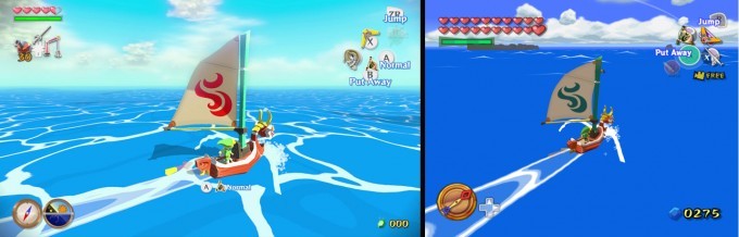
You're telling me they couldn't have made this image sharper? They could have expanded on detailed environments and hell, look at the belt buckle, it's not even that round.

Same drab textures and blocky objects, but boy, they sure are clear!
It's not going to look all that much sharper due to the artstyle of the game.[QUOTE="Toxic-Seahorse"]
[QUOTE="darkmark91"]
Yeah, I agree. It doesn't look all that much sharper. :|
CongressManStan
You're telling me they couldn't have made this image sharper? They could have expanded on detailed environments and hell, look at the belt buckle, it's not even that round.
http://au.ign.com/wikis/the-legend-of-zelda-wind-waker/HD_Screenshot_Comparison
Maybe this will help, there is a noticeable improvements from GameCube version. :)

the game they presented looks better than what they've shown earlier in the year. and seeing it in motion was :ohttp://au.ign.com/wikis/the-legend-of-zelda-wind-waker/HD_Screenshot_Comparison
superbuuman
Maybe this will help, there is a noticeable improvements from GameCube version. :)


I still think the impovments would be a lot more noticable if the remade Majora's.


They made it like that because they wanted it to appear that Link is actually feeling the sunshine so it is like that so you feel you're on the open ocean with the sun in your face.The thing that really bugs me is the lightening. They ought to tone it down just
a littlesimomate

That's a screenshot from the pre-production version of the game. Aunoma explicitly said in that Nintendo Direct that they were just playing around with the concept art from Wind Waker to test the WiiU's capability and came up with those screenshots.You're telling me they couldn't have made this image sharper? They could have expanded on detailed environments and hell, look at the belt buckle, it's not even that round.
CongressManStan
The final version of the game that we've seen this week looks very different.
Watch this, then watch this. If you still think the remake doesn't look HD, then... I don't know. You do know that high def refers to pixel density, not the shape of the polygons, right?

Can you play the whole game on the Gamepad?Rod90I'm pretty sure the developer said it was entirely playable on the gamepad. I could be wrong though.
[QUOTE="Rod90"]Can you play the whole game on the Gamepad?Toxic-SeahorseI'm pretty sure the developer said it was entirely playable on the gamepad. I could be wrong though.Yes it is entirely playable on the Gamepad alone.
I just hope they get rid the the blur that was beyond 20 yards. I hated trying to look into the distance.
They did get rid of it; The reason it had that was because they couldn't load the whole map at once on the GCN.I just hope they get rid the the blur that was beyond 20 yards. I hated trying to look into the distance.
Infinite_Access

watch the E3 trailer on the Wii U Eshop on an HDTV then tell me it doesnt look HD!
You can call me blind, but I hardly see a difference. I was expecting a difference similar to the N64 to 3DS Ocarina of Time where there was more detail added into the environment. Wind Waker HD doesn't look like there that much of a difference. I have the original WindWaker and have beaten it several time and I think it looks good, and of course the WindWaker HD looks a little cleaner, but there is no added detail into the environment besides a few clouds in the sky. The sailing looking IDENTICAL to what it did in the GC version. There are so many solid colors in the game, I feel like they would have chosen to add more detail to things such as the water and other environments. Windfall Island and Outlook Island appear to use the same texture patches.watch the E3 trailer on the Wii U Eshop on an HDTV then tell me it doesnt look HD!
JuanGrande386

Maybe they should add some REAL LIGHTENING! Sorry, couldn't resist. :PThe thing that really bugs me is the lightening. They ought to tone it down just
simomate
a little
[QUOTE="JuanGrande386"]You can call me blind, but I hardly see a difference. I was expecting a difference similar to the N64 to 3DS Ocarina of Time where there was more detail added into the environment. Wind Waker HD doesn't look like there that much of a difference. I have the original WindWaker and have beaten it several time and I think it looks good, and of course the WindWaker HD looks a little cleaner, but there is no added detail into the environment besides a few clouds in the sky. The sailing looking IDENTICAL to what it did in the GC version. There are so many solid colors in the game, I feel like they would have chosen to add more detail to things such as the water and other environments. Windfall Island and Outlook Island appear to use the same texture patches. before, i didn't think you knew what HD meant. now i don't think you know what art direction means.watch the E3 trailer on the Wii U Eshop on an HDTV then tell me it doesnt look HD!
CongressManStan
[QUOTE="JuanGrande386"]You can call me blind, but I hardly see a difference. I was expecting a difference similar to the N64 to 3DS Ocarina of Time where there was more detail added into the environment. Wind Waker HD doesn't look like there that much of a difference. I have the original WindWaker and have beaten it several time and I think it looks good, and of course the WindWaker HD looks a little cleaner, but there is no added detail into the environment besides a few clouds in the sky. The sailing looking IDENTICAL to what it did in the GC version. There are so many solid colors in the game, I feel like they would have chosen to add more detail to things such as the water and other environments. Windfall Island and Outlook Island appear to use the same texture patches. None of that has anything to do with picture quality. It could use five polygons for Link and three colors in the whole game and it would still be HD if the resolution is high enough.watch the E3 trailer on the Wii U Eshop on an HDTV then tell me it doesnt look HD!
CongressManStan
But now I know what you mean, at least. They didn't do much to change the art style. The intent from the beginning was to have a lot of solid colors and hard lines. That's what makes it look like a cartoon. A lot of people were really disappointed in the original screenshots for the remake because the characters were too shiny and looked more like toys instead of cartoons. I think the final product looks awesome.


Such a beautiful looking game.
I still think the impovments would be a lot more noticable if the remade Majora's.conkertheking1
No duh, and N64 game going HD would a bigger jump and more noticeable then a Gamecube game...


As beautiful as the original Windwaker looked, play it through your Gamecube with the regular cables on a 1080p TV, and then come back and tell us this remake doesn't look HD.
As beautiful as the original Windwaker looked, play it through your Gamecube with the regular cables on a 1080p TV, and then come back and tell us this remake doesn't look HD.
MrDziekuje
Well anyone using composite cables on a HD screen is an idiot, I'm not sure why you'd even suggest that.....
well the problem is that the format used to run wind waker isn't really supported in current TVs, so it looks pretty blurry, even if you use 4:3.One thing that comes to mind when looking at the screenshots of the original game is how it has not aged one tiny bit.
When it comes to visuals, its timelessness is pretty much unparalleled. It's just mind-blowing to think it came out a decade ago.
Pierst179
Maybe I'm just nuts, but I like the HD-ified version of WW than the Wii U version. That lighting is just awful.LongZhiZi
Maybe :P
Ha! Seriously, though, the game does look different with these new changes--it's not a strict upgrade / remaster, it looks different. There's certainly room for personal prefferance.
Reposting a couple of images from before -- the color scheme is lighter and the overall style looks less like a cartoon.

Yeah, I like the bolder colors and cartoony-er look of the original. It's not that the HD version is bad (except for that bloom...just awful), I just liked the cartoon look of it and feel like it's being a bit lost.
I'd get a Wii U and the remaster if they actually allowed me to use standard aiming controls instead of inverted.

[QUOTE="Pierst179"]well the problem is that the format used to run wind waker isn't really supported in current TVs, so it looks pretty blurry, even if you use 4:3.One thing that comes to mind when looking at the screenshots of the original game is how it has not aged one tiny bit.
When it comes to visuals, its timelessness is pretty much unparalleled. It's just mind-blowing to think it came out a decade ago.
BrunoBRS
Oh well, I had never tried it.
Still, it remains quite a visual achievement.
Please Log In to post.
Log in to comment