Prince of Persia 2 (working title) Q&A
We talk to the sequel's artistic director for the lowdown on the Prince's stylish new look.
Prince of Persia 2 has been turning heads since it was shown off at this year's E3. Besides being the sequel to last year's critically acclaimed 3D update of the classic franchise, the game has made quite a splash thanks to its hard-edged look and gameplay. We had the opportunity to interrogate artistic director Mikael Labat, who is hard at work up at Ubisoft's Montreal studio where Prince of Persia 2 is currently in development, on the evolution of the game's new look.
GameSpot: What would you say were the biggest strengths of the art design in the first Prince of Persia?
Mikael Labat: Well, Prince of Persia: The Sands of Time was certainly one of the most original settings of 2003 games. Persia is a theme that is both very rich and unique in video games. I think we managed to convey the mystery of this universe and that’s what made this game so attractive. Several art and design guidelines allowed us to reach this level of quality. We had tons of references to the Persian style when we started the production. This helped us to create a very credible world. And thanks to an impressive technology, PoP-SoT was one of the most beautiful games on consoles last year.
GS: Looking back, what elements in the first game do you wish had been more polished? How did that affect the development of PoP2's art?
ML: Well, I wouldn’t say "polish," as PoP-SoT is a game for which we really took the time for an almost perfect polishing. But, of course, there were still places for improvements, but it asked us to think differently. We completely changed the art direction to let us find solutions to surprise the player. Our objective was to make all environments more beautiful, more detailed, more alive, more immersive... We also focused on the character design. Indeed, this was our first goal when we started PoP2 development: to make sure we would have memorable characters, the kind of heroes or enemies players would remember. And I think we have managed this so far.
GS: How did the new, hard-edged direction influence PoP2's art? (Generally speaking and in relation to the new look for the prince.)
ML: Well, it all started when we defined the new emotions we wanted the player to feel in PoP2, namely fear and oppression. The player will play a prince that is cursed and that will have to face his own destiny, his own death. This had to transpire in the artistic direction. Naturally, we came to a more mature, darker treatment, also oppressive and violent.
We spent a lot of time on defining colors, lights, materials, and all the details that help make the atmosphere of each place of the game almost unique.
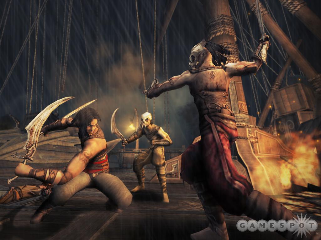
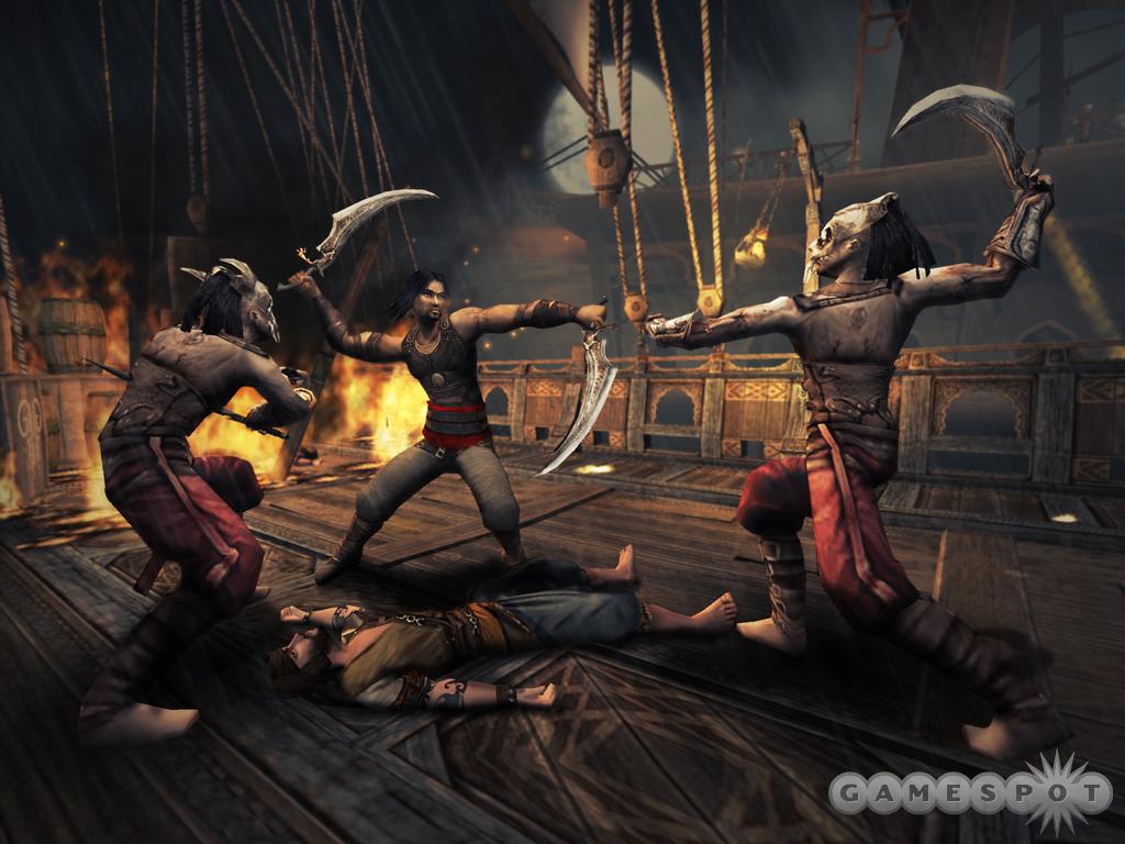
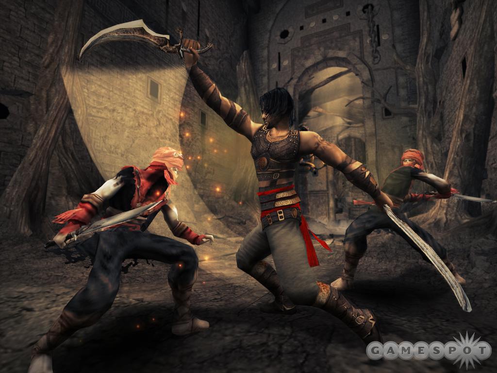
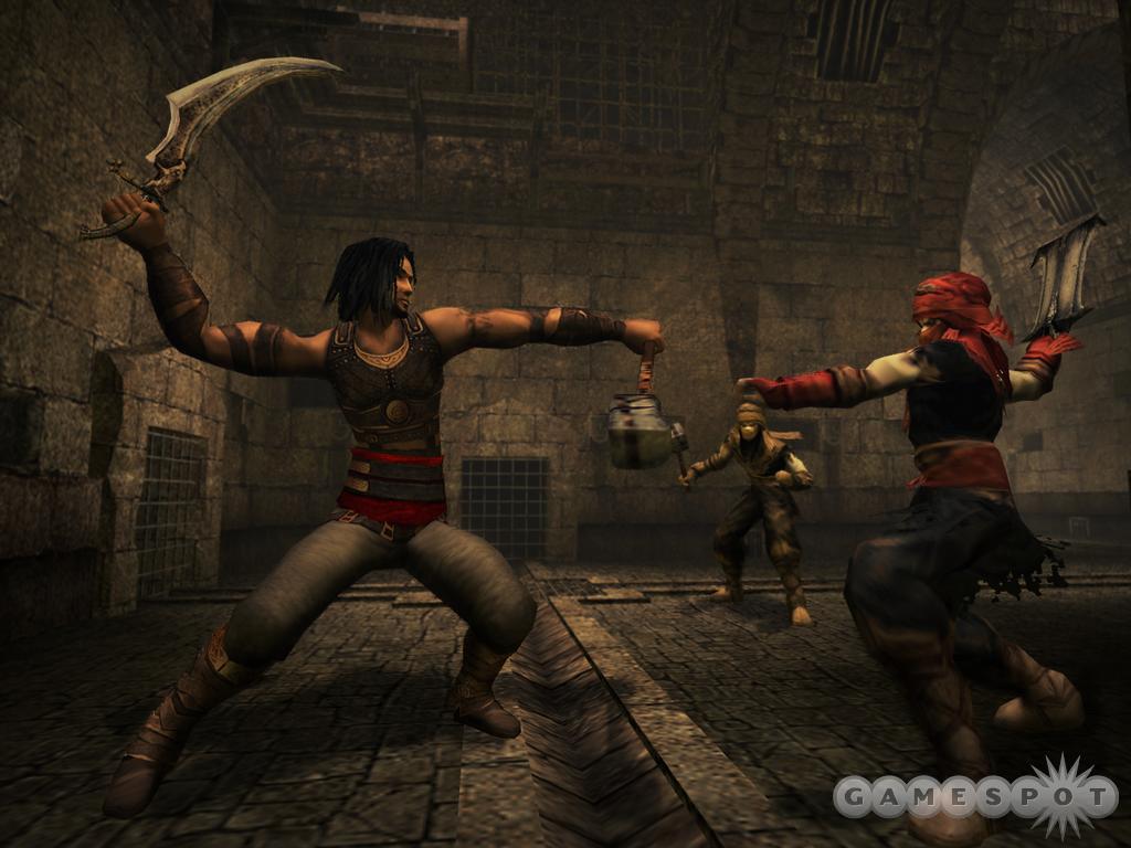
Of course, we also had to work on character design to reinforce this new treatment. A good example is the prince; we redesigned him to make him older, more mature. Right now, he is a master warrior and we use specific materials that reflect his new personality: leather armor close to his body that will protect him but also allow him to perform masterful athletic moves, leather strips around his arms, and flexible boots. The player will feel his rage and aggression with his attacks and his enormous determination.
GS: The first game's architecture had a consistently Middle Eastern style; from what we've seen of the new game, there's a distinct piratical influence at work. Why this change in direction?
ML: In fact, we keep more or less a Persian influence. We wanted to move away from the "Arabian Nights" treatment of PoP-SoT, and at the same time, we wanted something that would fit with the dark treatment--something massive like a fortress or a prison, typically a place you wouldn’t like to spend your holidays. We took most of our inspiration from the ancient Near East history, like Persia, Mesopotamia, Babylon, The Hanging Gardens, but we added a fantastic touch to it.
GS: Will the new game's level designs adhere to a singular theme throughout, as in the first game, or will we see a greater range of cultures represented?
ML: Actually, I think this game will offer more diversity. Not only will the player discover incredible places like an ancient Persian boat, a cemetery of boats, a huge castle, luxurious gardens…but he will also navigate between 2 completely different time periods: present and past. Each period has opposite atmospheres: Present is a place of desolation and chaos, nature took the upper hand on human buildings just like in temples. The color palette is desaturated, reinforcing this desolate feeling. Past, on the contrary, is bright, luxurious, and still somehow intimidating. The color palette heads toward brighter colors: red, yellow, green. The architecture is imposing, vertiginous--but always with a level of detail high enough to avoid a feeling of emptiness.
GS: Where did you look for inspiration when crafting the game's look? Any particular films, or even other games, that have impressed you?
ML: Well, we have a wide range of inspirations from movies to games through illustrations or cartoons. The Lord of the Rings movies have been a great source of inspiration for the environment. Peter Jackson did an impressive job of making fantastic universes credible. I‘m also a big fan of most of Tim Burton's movies for the tone he manages to create. For creatures, Brom’s illustrations were very interesting to look at. Finally, for games, I would say that Silent Hill was a good benchmark to define the atmosphere we wanted to create.
GS: Has the increased focus on combat in PoP2 allowed you to do anything new with the enemy designs?
ML: Yes, of course. We had great freedom in creating enemies. Our objectives were that they should be very impressive, at times even frightening or intimidating. Then we also wanted a large diversity in order to generate different gameplays and different types of threats: bloody female assassins, huge well-armored giants, hordes of smaller animals, and so on. On all designs, the general guideline was to use dark materials like bronze and leather--it gives them a very realistic aspect, together with a real toughness, and you really feel they belong to the dark worlds we created.
GS: What would you say is the key difference between the art of PoP 1 and 2?
ML: In terms of general impression, PoP 2 features a far more mature treatment, a darker look and a more oppressive, almost mystical atmosphere. We worked a lot on the ambiance and on many little details. Moreover, the difference between past and present creates a good variation between darkness and light. And all of that will make each place almost unique and memorable.
GS: How closely are you working with the level and gameplay designers to retain the same kind of artistic, but functional, design we saw in the first game?
ML: It’s all a question of sharing the same initial objectives and vision. Of course, we have to work together on a daily basis to review all maps and refine little details. Since PoP-SoT, I think our team has become very skilled in refining the gameplay without forgetting the atmosphere and attention to visual details.
GS: Given the game's apparent shift in style, will we see any throwbacks to classic swashbuckling action, such as Harryhausen-esque, cutlass-wielding skeletons?
ML: Yes, swashbuckling movies (classic and recent) have been our first source of inspiration for the gameplay. We want to provide players with a unique combat experience, both very playable and visually stunning. For this reason, we start the game on a boat during an attack, featuring flying arrows, jumping on ropes, sword fighting, and boat collisions. This is the best example of the action movie inspiration that guided us through the whole development of the game.
GS: Thanks for your time.
Got a news tip or want to contact us directly? Email news@gamespot.com
Join the conversation