Freedom Force Designer Diary #11
3D Artist Sylvia Chong details all that's involved in creating the look and feel of the game.
Entry #11 - 12/10/01
By Sylvia Chong
Junior 3D Artist, Irrational Games
Having worked on Freedom Force since May last year, I find it interesting to reflect on how much the game has evolved. I remember some of the earliest test levels that were produced--crudely planned city blocks consisting of pinkish buildings, bulbous trees, and rodent-sized characters. Things didn't fit. The scale was all wrong. There was no sense of style or cohesion. The world looked bland.
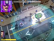
It took a lot of work and rework to get Freedom Force looking the way it does now. The city actually looks alive. Colors are more vibrant, and each city block contains something of visual interest--whether it be an animated billboard, a giant novelty sign, paper blowing down an alley, or pigeons flying across the sky. And let's not forget the levels that are not city based...but that's something for later.
We're only a couple of months away from completion, and there is still much to do, but the giant leaps and bounds have been made, and it's undeniably exciting to see everything finally coming together. The game has definitely come a long way. In this diary, I will present a rough overview of some of the thoughts and processes behind the creation of visual content for Freedom Force.
One of the first things to consider when starting a project is obviously the setting and genre of the game. This will influence the type of mood and overall feeling that you want to convey. What kind of world is it? What kind of style will be most appropriate? What kinds of colors or even how much color will you use? How realistic will you want things to appear? There are many questions that need to be measured and weighed.
In the case of Freedom Force, the setting and genre is based on an already established media--the comic book. But more specifically, American superhero comics of the silver age. This in itself answers a lot of our questions but also poses some interesting challenges. How do you make a 3D world feel the same as a 2D one? Should we use shading to enhance and give depth to the world or keep them flat and true to the media at the risk of producing art assets that appear lazy and incomplete? It really comes down to deciding how closely we want to stick to the original look of the silver age--what will work for us and what will work against us.
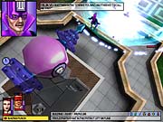
What we wanted to generate was the feel of an American city as portrayed in comics of the late 1950s. It had to be reasonably clean, bright, and cartoony but still look lived in and have a little wear and tear. It couldn't be too plastic. There had to be dirt, but we couldn't fall into the trap of becoming too dark and grimy. The environment also had to look interesting and fun. Additionally, we also wanted to capture the overstated and cheesy characteristic of that genre. It was essential to re-create those bathtub-looking supervehicles and the ray gun with the enormous crosshair--not to mention those wide-mouthed, blocky-framed characters with the wacky costumes and bad color coordination. Those are the things that would really give Freedom Force flavor.
To achieve the look we were after, we found that it worked best when everything was made iconic. By simplifying appearances, it made objects immediately identifiable and even comical. This was also very important for gameplay. Initially, we focused a lot more on realistic scaling, and this produced levels that were hideously oversized and frustrating to play on. Street objects that would be hurled during the game would also prove more difficult to select at a realistic scale. This isn't to say that everything was blown out of proportion--objects still had to look and feel right in relation to each other, but we gave ourselves that added flexibility in the style we were adopting.
Developing a strong library of street objects became very instrumental in bringing levels to life. Animated objects, effects, and lighting also went a long way in spicing things up. We have park areas where butterflies will circle around bushes. Leaves will occasionally fall from trees. Desertlike levels have mini whirlwinds pass by. It snows in some missions, and it's night in others. A city block is essentially a bunch of glorified boxes, and by themselves, they certainly look the part. Dressing up the levels, without breaking the frame rate, really became an art in itself.
In terms of dealing with re-creating a 2D look in a 3D game, I personally tried to incorporate 2D shading methods into the object's texture. My main focus is in character creation, so when I painted up a skin for a character, I would add bold lines to anything that was metallic or that could withstand such aggressive treatment. I would refer to the classic comic works of the time and try to replicate those distinctive patterns and shading techniques he uses. I also tried to use a lot of black to define the characters and hopefully make them stand out. In the end, we are still dealing with 3D objects, and they have to work from all angles, so there was a limit to how much "2D-ness" we could enforce upon them--without making them looking anomalous. Keeping other elements like the interface and origin stories looking 2D also helped in bridging the disparity in dimensions.
Another important aspect that we want to keep in mind is the gameplay. This sounds pretty blatant, but sometimes it's easily overlooked. How the game is designed and how large or small particular objects will appear onscreen is significant when it comes to making them. The size of an object will determine how much resolution its texture will have and perhaps how many polys it will be assigned. It's really a case of being efficient and economical.
Gameplay will also guide a lot of other decisions that are made concerning the graphics. How can it further enhance the gaming experience? Freedom Force is a tactical combat game, so most players would probably prefer to play with the camera pulled back slightly rather than zoomed right in. Many decisions can be made just from this assumption. For instance, clear visibility of characters is vital, but compared with the buildings around them, they are considerably smaller. To compensate for this, all the characters have different material settings to make them a little brighter and to help project them from their surroundings. Some characters were also beefed up slightly so that they didn't look too scrawny from a distance.
Ultimately, we want to create great-looking graphics that have character and life, but they must also enhance and complement the gameplay as well as run proficiently.
Well, that's it from me! Freedom Force will be released Q1 of 2002, so keep those eyes peeled!
Got a news tip or want to contact us directly? Email news@gamespot.com
Join the conversation