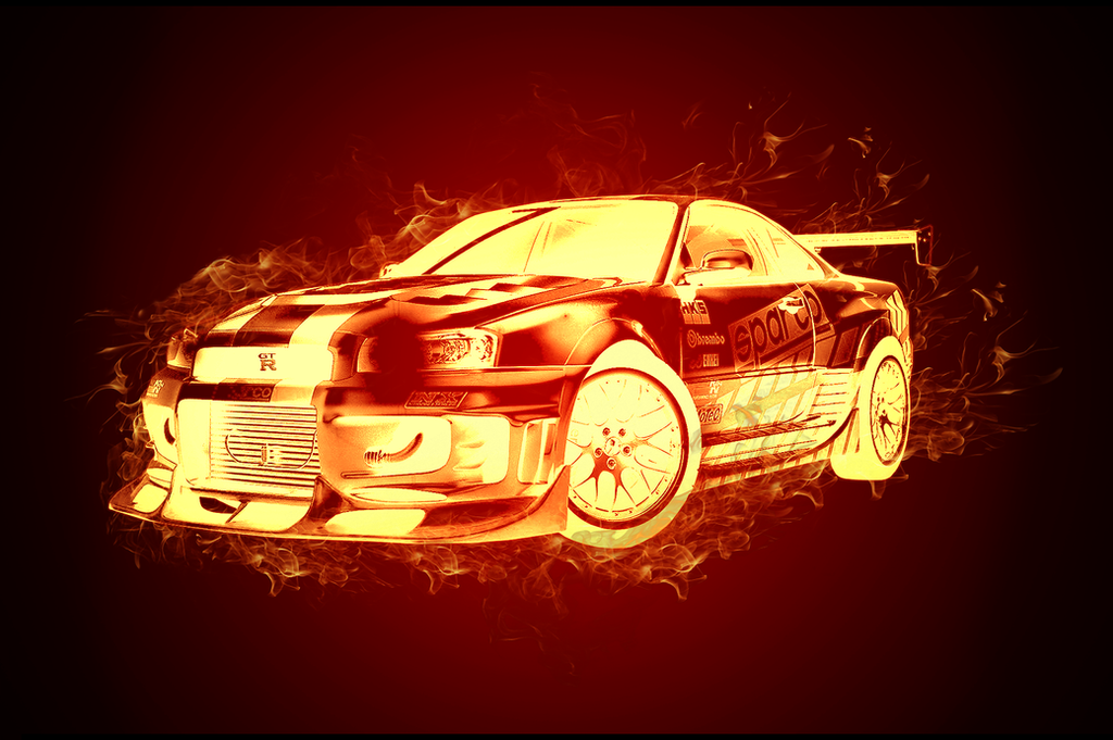
unlike the other one, i'm not a big fan of this. it comes off as a weird gradient map with a bunch of fire stocks surrounding it.
the main two problems are that you didn't manage to nail the color to make the car look fiery, and the flame stocks do not blend in at all (the inclined position of the car probably makes it hardder than it could be)
It looks very unnatural as a whole Fire stocks don't look blended in, looks like they're sitting ontop of the car The car itself, like bruno said, doesn't look fiery, it looks inverted + a weird gradient map combined together tbh Not a fan, sorry
 [/spoiler]
Log in to comment