I'm quite happy with this one tbh
inb4colorsaresouglywtfwereyouthinking
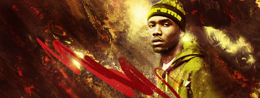
V2:
Added shapes + improved contrast on face + fixed colors on clothes


The clothes should be a bit browner to match the BG better, and the contrast on him and near his face is a bit too high. Maybe add some more pentooling or shapes here and there, the compo is still kinda "render+smudged BG+pentool in one place", add a bit more too it, looks kinda like a WIP, but I'm liking it so far, I wanna see it improved.DudersaperBut I didn't use smudging:|
And I do see what you mean about the contrast, I'll get that fixed
But I didn't use smudging:|anihimzDoes it really matter? My point still stands.
I simply love it! And how you did this without smudging?Jas0n94I revisited the displace filter
random pentool sticks out and doesn't really match the rest of the styIe. but it's not bad.BrunoBRSI wouldn't know what else to replace them with. I personally like it there, but I'll make a version without the pentool for you
Gonna work a V2 today
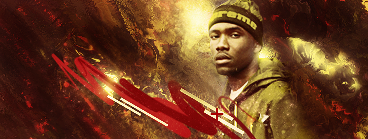
I like V2's contrast better.
But why did you add shapes only over the pentool? Why not add more stuff around the sig, it's like you can only add effects on that center part or something.
Add more pentooling here and there, make it not look like a random thing just shoved in the center.
Okay I'll try that in a bitI like V2's contrast better.
But why did you add shapes only over the pentool? Why not add more stuff around the sig, it's like you can only add effects on that center part or something.
Add more pentooling here and there, make it not look like a random thing just shoved in the center.
Dudersaper
Please Log In to post.


Log in to comment