
Would anyone be willing to make a sig for me, using a scene from The Fountain orBlack Swan? Any image from the movie should be fine, but add a little artistic flair. Pleaaase? :D
Sig/Avay/Banner...Rate/Req/Disc Thread. Holidays Version!
This topic is locked from further discussion.

it's alright you didnt come off as one :P
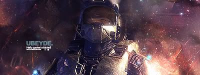
also no I actually just did a lot of smudging of a few colors, put a filter over them and then put a brush (the green you see) on it because people were telling me only 1 effect was too boring :P this was the original

also gamespot stop being a dick my html is perfectly fine and you know it. Not letting me quote people isnt cool

I'll do this if no one else has started. Do you want your name on it?Would anyone be willing to make a sig for me, using a scene from The Fountain orBlack Swan? Any image from the movie should be fine, but add a little artistic flair. Pleaaase? :D
harashawn
Would anyone be willing to make a sig for me, using a scene from The Fountain orBlack Swan? Any image from the movie should be fine, but add a little artistic flair. Pleaaase? :D
I'll do this if no one else has started. Do you want your name on it? I wouldn't mind my name on it. :P
[QUOTE="michael_1234576"][QUOTE="harashawn"]I'll do this if no one else has started. Do you want your name on it? I wouldn't mind my name on it. :PWould anyone be willing to make a sig for me, using a scene from The Fountain orBlack Swan? Any image from the movie should be fine, but add a little artistic flair. Pleaaase? :D
harashawn

thats the best I can do
I wouldn't mind my name on it. :P[QUOTE="harashawn"][QUOTE="michael_1234576"] I'll do this if no one else has started. Do you want your name on it?michael_1234576
thats the best I can do
Holy man that's awesome. :shock: Thanks a bunch! :D :PWould you mind doing one for The Fountain, too if you have the time? I can put them on a rotator.
Holy man that's awesome. :shock: Thanks a bunch! :D :PYeah sure anything for a fellow Canadian :P it may take a day or two because I have some work to do.
Would you mind doing one for The Fountain, too if you have the time? I can put them on a rotator.harashawn
discard the last part of my previous post :lol: hope this is to your likeing sir.

Still waiting on a good Super Street Fighter 4 sig and possible avy. So far for an avy I have Makoto but a good Fei Long, Cammy, or Ken would be sweet. I would appreciate if anyone took the time to make one up for me. Thanks.

 Any good? I think it incorporates everything you mentioned... :P

Still waiting on a good Super Street Fighter 4 sig and possible avy. So far for an avy I have Makoto but a good Fei Long, Cammy, or Ken would be sweet. I would appreciate if anyone took the time to make one up for me. Thanks.
worthyofnote
Ghlegend...
I'll take that.


sigs.
Ubeyone
Those are amazing.
We have another thing in common I see :P
[QUOTE="arad96"]If you remove the border which is ruining your sig, i'll give it a 8/10 Render is quite well blended, colors fit just fine and in overall a good sig. Just remove the border and you'll be okCould someone rate and comment on my current sig?
Azaru32
Border removed. Thanks for the rating.
Anyone up for my request?


You called?Ghlegend...gamingqueen
Made my theme. Week into GIMP.


rate mine? i made in like 5 minutes in photoshop a little bit ago lol
il make it for ya. il try to make it a similar size to the one you are using.I'm looking for a new sig and I was wondering if someone would care to help me.
Having Muller39 somewhere on there would be greatly appreciated as well.
muller39
nvm thats the wrong one dont use

ok here is the good one.
I would like to officially thank gamingqueen for the avy and the sig.
[QUOTE="taterfrickintot"]
ok here is the good one.
muller39
Thank you!
No problem broI was wondering if someone could  do a signature with this image and having the text saying 209 please? With the colors red and white. Thanks in advance.
so whadda you guys think of this one maybe?


OT, rate my newest sig, please:

I think it's superb, aside from the lack of text.
Other result:

Rate my Newset theme.
GIMP - Week 2.
I uased this stock:

Rate my Newset theme.
GIMP - Week 2.
I uased this stock:
the-silent-hero
Rawr love it! Colors are very inspiring! Will make me something similar :)
I think it's superbSovietsUnitedIt's not.
aside from the lack of text.SovietsUnitedThe text on the second outcome is horrible. Not all signatures need text.
OT, rate my newest sig, please:k 4.6/10 Why? The render doesn't match the background, it really needs better blending. There are almost NO effects, something that all sigs need in order to generate depth. Render place ment could be better, and lighting isn't that great. Also, the colors are bad.
[QUOTE="SovietsUnited"] It's not. [QUOTE="SovietsUnited"]aside from the lack of text.GHlegend77The text on the second outcome is horrible. Not all signatures need text.
OT, rate my newest sig, please:k 4.6/10 Why? The render doesn't match the background, it really needs better blending. There are almost NO effects, something that all sigs need in order to generate depth. Render place ment could be better, and lighting isn't that great. Also, the colors are bad.
Maybe a wee bit harsh GH... :P I agree the text needs to go, but it really isn't all that bad, silver and blue fit just fine together. :) I give it 6.5/10
Render doesn't blend in with the colours ? Colours are bad ? No depth ?
WAT
Are 14 filter layers just for the background really that shallow :\
I agree about the text though :)
Anyways, give same harsh critique on this oldie :) :

EDIT:
One final try, if it's not good, I give up:

Render doesn't blend in with the colours?SovietsUnitedThe shade of blue that you used for the bg doesn't come close to matching any of the shades of blue that are on the render.
Colours are bad?SovietsUnitedSee the above. Had you used the blue shade on his eyes for the bg, it would've looked pretty sick.
No depth?SovietsUnitedThere's no foreground effects. Not one. The way that it is right now, it seems very 2d. Blurring the bg even slightly will do wonders for the depth.
I guess i'll make my own signature.
Please Log In to post.
Log in to comment