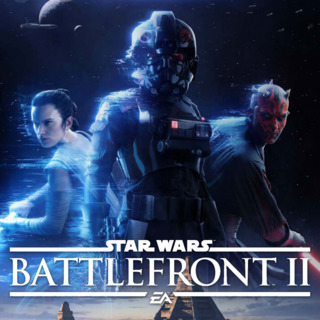
I just want to let everyone know up front that I'm not a pro gamer. My favorite games to play are mostly anything Zelda. When I bought a my first PlayStation gaming system for the first time I was more than exited that I'd be able to start out by playing Battlefront II but little did I know the frustration I was in for.
To add a little bit more to my background I have a degree in Visual Design and 12 years of professional design experience in multimedia, which includes: Web Design, Editing Video/Audio, 3d and 2d animation, Print Design, UI design and more. In other wards,...I think I know my stuff or else I wouldn't be getting paid to do this still.
Going straight to my NUMBER 1 biggest problem of the whole game, Alessandro Fillari says it best in his review "Two steps forward, three steps back" posted Nov 20, 2017 . Quote "The biggest problem with this system is that it's never clearly explained." - OH MY GOSH YES!!!!!
I can't say anything better on game play than what he's already written so go and read what he has to say about the actual game play.
THIS GAME IS BASED ON ASSUMPTION WHICH IS THE BIGGEST FAIL IN DESIGN...EVER!!!
There needs to be CLEAR recommended video and written tutorials and walkthroughs on the what and how do things in the game.
I still go to and search for help and understanding the game such as:
https://help.ea.com/en-us/help/star-wars/star-wars-battlefront-ii/star-wars-battlefront-ii-get-started/
Which is EA's own ARTICLE on getting started and only 38% of viewers found the article helpful....ON EA'S WEBSITE PEOPLE!!!!!!????????? Clearly that should be an indication that people aren't getting the information they need to have a great user experience.
The fact that I have to go online to find out how to do something on the game is a FAIL.
http://cdn.wccftech.com/wp-content/uploads/2017/06/bf2_alpha_1-740x416.jpg
The game looks like it was designed by someone with three screens sitting at their PC, which it probably was! The problem with that is that YOU NEVER STEPPED AWAY FROM YOUR DESK TO VIEW THE CONTENT FROM FARTHER AWAY - which is where most people playing at home will be -farther away from their home televisions. So the text needs to be larger and bolder and readable from a distance which I didn't find to be the case. At the very least there should be display in text options.
Let's talk about the Home Page. I'm going to get super designer picky here so bare with me. Everything is left aligned and doesn't use basic design skills like, the rule of thirds. I'd like to see something with a centered design. A centered design is more balanced (kind of like the force should be).
The "Play" tab SHOULD NOT EXIST AT ALL. "Play" should show immediately on the Main/Home screen and should be the first thing you see. Under play should be Campaign/Multiplayer/Arcade. The Main/Home Screen doesn't even need to be named. It could be a symbol that is recognized as Home.
One of the tabs could be named "MISSION" or something else (Extras/Galactic Gazette?) and have all the extra home stuff on it including other much needed things like better tutorials, news and challenges.
If new challenges need to appear upfront, it should be on the side of the play block or after you select Campaign/Multiplayer/Arcade the information can appear and be specified to what you choose.
Buying and collecting crates should be on the COLLECTION tab.
It should be made clear, WHAT you can collect, How you can collect, what you can buy when you collect and what and how to use what you buy.
I have like thousands of credits and I still don't know how or what to do with them...someone says I can buy crates/skins with them but I have yet to find how to do that. It feels like credits are useless.
TheAutisticGamer1 writes: "Yeah. I have 80,000 credits and i don't know how to use them. Edit - 100K Now." written on the YouTube Video "CREDITS, SKILL POINTS, CRYSTALS - Star Wars Battlefront 2 Starter Guide" Mar 30, 2018 - It's the #1 comment followed by "same" for most other comments.
That's a shame. What's the point of earning something if you can't use it????
Rey looks MALE! And Luke doesn't look like Luke. Non of the main characters that don't have masks look that great. You can do better. Way better.
A few suggestions:
Hold a contest for the Main Screen UI - You'll get better designs that way...or at least get a couple different designers to make up different versions.
Test things on people without much gaming experience. It's a good way to see if your instructions are clear. It also opens up your market to more people who will want to play your game because the game wouldn't rely on just people who already know how things work in the game -which is who I feel the game is marketed to, -people who've already played before. That limits your audience and money making.
You should really step away from the desk more when designing this thing. People need to be able to clearly read things.
Listen to the complainers. WE WANT TO PLAY THIS GAME!!! TRUST ME!!! It's just really frustrating. I think you have some good things going for it but where there's confusion and misunderstanding or lack of knowledge that frustration will out weigh the desire... So FIX that.
- Much more to say but for now, TY and MTFBWY always.
https://www.reddit.com/r/StarWarsBattlefront/comments/741ss6/new_menu_screen/

