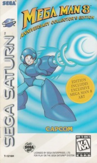
Rather prefer to play with MegaMan 7 sprites
User Rating: 5 | Mega Man 8 (Anniversary Edition) PS
...than this milked up graphics and weird color schemes...And I say milked up because they use this in 3 games, Rocman & Forte for the SNES, Megaman and Bass for GBA and this one. But the plot is good and actually have a sense for a MegaMan (classic) game. But overall is not THAT MegaMan yet. The closeset feel to a Megaman game feat. the classic blue bomber was Mega Man 7...and Capcom should stick to that looks instead of a "tired floppy look" in MM8 or a girly one in Powered Up.
Seriously, Capcom...revamp MM8.
Also, bosses tried to be original...but most of them were kind of a miz between X series and Classics.
Im still waiting for that ultimate Classic series games that makes a logical connection with the X series.
And where are those E tanks and that kind of things?! NOWHERE! but thats not an important thing...the thing that pisses me off is the grpahics!!! Gosh they are so bad for a Megaman game.

