Kojima reveals Death Stranding box art

Avatar image for SolidGame_basic
SolidGame_basic

45061

Forum Posts

0

Wiki Points

90

Followers

Reviews: 0

User Lists: 0

Poll Kojima reveals Death Stranding box art (46 votes)

Standard version is better. 30%
Steelbook is better. 15%
They're both great. 20%
They both suck. 35%
No Caption Provided

I actually think I like the standard one more. It gives more context. Also, am I the only who thinks the lines coming off the letters looks dumb? Especially on the steelbook? Anyway, what do you think of the box art, SW? Have preference for either one? Like both? Or do both suck?

 • 
Avatar image for davillain
DaVillain

56036

Forum Posts

0

Wiki Points

0

Followers

Reviews: 0

User Lists: 5

#1 DaVillain  Moderator
Member since 2014 • 56036 Posts

Standard version is better.

Avatar image for deactivated-63d2876fd4204
deactivated-63d2876fd4204

9129

Forum Posts

0

Wiki Points

0

Followers

Reviews: 0

User Lists: 0

#2 deactivated-63d2876fd4204
Member since 2016 • 9129 Posts

Generic AF

Avatar image for uninspiredcup
uninspiredcup

58847

Forum Posts

0

Wiki Points

0

Followers

Reviews: 86

User Lists: 2

#3  Edited By uninspiredcup
Member since 2013 • 58847 Posts

It's... kinda bad.

Just like, the basic composition doesn't look right.

Avatar image for boxrekt
BoxRekt

2425

Forum Posts

0

Wiki Points

0

Followers

Reviews: 0

User Lists: 5

#4 BoxRekt
Member since 2019 • 2425 Posts

That is fantastic.

It really says everything. Hyped.

Avatar image for deactivated-5ea0704839e9e
deactivated-5ea0704839e9e

2335

Forum Posts

0

Wiki Points

0

Followers

Reviews: 0

User Lists: 5

#5 deactivated-5ea0704839e9e
Member since 2017 • 2335 Posts

That standard version looks like shoddy photoshop work.

The LE edition looks like a GQ cover.

David Hayter should have never been replaced but that guy up there would be a better choice than Sutherland imo

Avatar image for Archangel3371
Archangel3371

44102

Forum Posts

0

Wiki Points

0

Followers

Reviews: 4

User Lists: 0

#6 Archangel3371
Member since 2004 • 44102 Posts

I think they both look just ok. I definitely wouldn’t say that they are great or that they suck though. They just both look equally ok but kind of meh to be honest.

Avatar image for pc_rocks
PC_Rocks

8469

Forum Posts

0

Wiki Points

0

Followers

Reviews: 0

User Lists: 5

#7 PC_Rocks
Member since 2018 • 8469 Posts

MGS covers were much better, this looks like they spent all their budget on getting hollywood actors.

Avatar image for boxrekt
BoxRekt

2425

Forum Posts

0

Wiki Points

0

Followers

Reviews: 0

User Lists: 5

#8  Edited By BoxRekt
Member since 2019 • 2425 Posts
@goldenelementxl said:

Generic AF

lol maybe

But when it looks to match the tone of something that's horrifying with deeply psychological elements, taking hints from works that personified that feeling in the past isn't necessary a bad thing.

And, it's better than something that's generic and lifeless as this
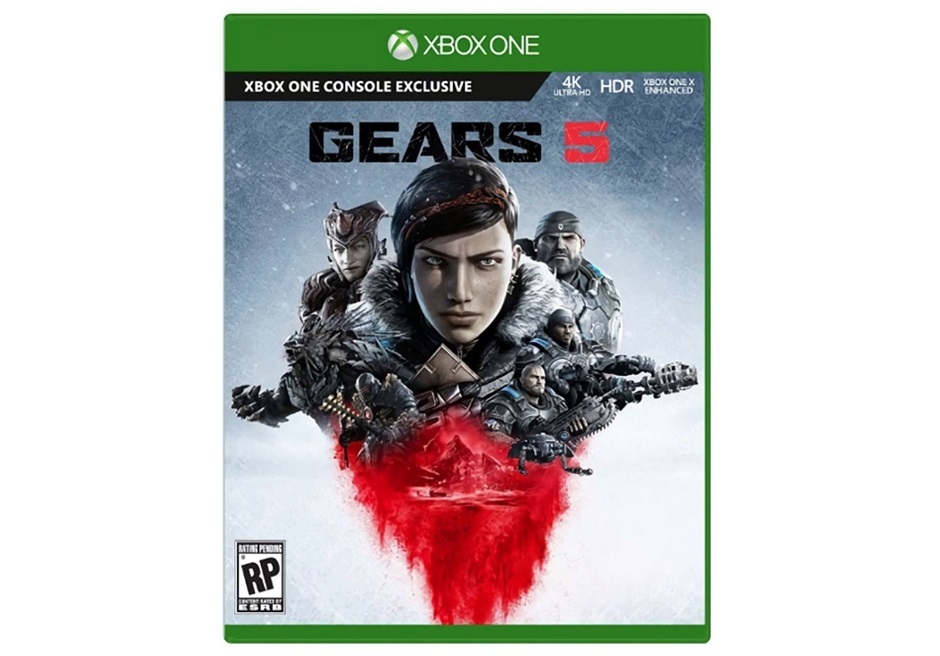
BTW, both are terrific and convey the sense of the game beautifully, I may double down.

Avatar image for doomnukem3d
DoomNukem3D

445

Forum Posts

0

Wiki Points

0

Followers

Reviews: 0

User Lists: 5

#9 DoomNukem3D
Member since 2019 • 445 Posts

Generic but not awful like this Gears 5 box art posted above me.

Avatar image for deactivated-6068afec1b77d
deactivated-6068afec1b77d

2539

Forum Posts

0

Wiki Points

0

Followers

Reviews: 0

User Lists: 1

#10 deactivated-6068afec1b77d
Member since 2017 • 2539 Posts

The steelbook looks better. It show Norman Reedus in an unnatural state compared to the other one.

Avatar image for kali-b1rd
Kali-B1rd

2241

Forum Posts

0

Wiki Points

0

Followers

Reviews: 0

User Lists: 5

#11 Kali-B1rd
Member since 2018 • 2241 Posts

Amazing what kinda gam.... is... thi....

Avatar image for pc_rocks
PC_Rocks

8469

Forum Posts

0

Wiki Points

0

Followers

Reviews: 0

User Lists: 5

#12 PC_Rocks
Member since 2018 • 8469 Posts

Well just to make cows rage...the box art is missing one key thing. :D I know exactly how cows will going to DC that.

Avatar image for DragonfireXZ95
DragonfireXZ95

26645

Forum Posts

0

Wiki Points

0

Followers

Reviews: 0

User Lists: 0

#13 DragonfireXZ95
Member since 2005 • 26645 Posts

They are both pretty meh.

Avatar image for lundy86_4
lundy86_4

61473

Forum Posts

0

Wiki Points

0

Followers

Reviews: 2

User Lists: 0

#14 lundy86_4  Online
Member since 2003 • 61473 Posts

Both are... Lackluster.

Avatar image for deactivated-63d1ad7651984
deactivated-63d1ad7651984

10057

Forum Posts

0

Wiki Points

0

Followers

Reviews: 0

User Lists: 13

#15 deactivated-63d1ad7651984
Member since 2017 • 10057 Posts

It's ok at best but I have seen much worst this gen just look at the generic Spiderman boxart they could of least adding a NYC background.

Avatar image for Pedro
Pedro

69361

Forum Posts

0

Wiki Points

0

Followers

Reviews: 72

User Lists: 0

#16 Pedro
Member since 2002 • 69361 Posts

Its missing the "Only on Playstation" in the top right corner. Is that the real box art? ;)

Avatar image for boxrekt
BoxRekt

2425

Forum Posts

0

Wiki Points

0

Followers

Reviews: 0

User Lists: 5

#17 BoxRekt
Member since 2019 • 2425 Posts
@pc_rocks said:

Well just to make cows rage...the box art is missing one key thing. :D I know exactly how cows will going to DC that.

If Sony haters liked it then, I might actually be worried.

Anti-Sony system wars fanboy opinion on everything this gen has literally been 100% the opposite of the entire game industry and every gaming demographic in the real world.

Avatar image for Macutchi
Macutchi

10416

Forum Posts

0

Wiki Points

0

Followers

Reviews: 4

User Lists: 0

#18 Macutchi
Member since 2007 • 10416 Posts

steelbook edition looks more like brock lesnar than norman whatshisface.

@boxrekt said:

gears box art has never been the best but that's pants

Avatar image for clone01
clone01

29824

Forum Posts

0

Wiki Points

0

Followers

Reviews: 0

User Lists: 0

#19 clone01
Member since 2003 • 29824 Posts

The original mega man boxart is way better.

Avatar image for drlostrib
DrLostRib

5931

Forum Posts

0

Wiki Points

0

Followers

Reviews: 0

User Lists: 5

#20 DrLostRib
Member since 2017 • 5931 Posts

that standard cover is a little too uncanny valley

Avatar image for dxmcat
dxmcat

3385

Forum Posts

0

Wiki Points

0

Followers

Reviews: 0

User Lists: 0

#21 dxmcat
Member since 2007 • 3385 Posts

box art? rofl. I didnt realize blockbuster still existed.

Avatar image for freedomfreak
freedomfreak

52424

Forum Posts

0

Wiki Points

0

Followers

Reviews: 0

User Lists: 0

#22 freedomfreak
Member since 2004 • 52424 Posts

They both look awful.

Avatar image for Litchie
Litchie

34572

Forum Posts

0

Wiki Points

0

Followers

Reviews: 13

User Lists: 0

#23  Edited By Litchie
Member since 2003 • 34572 Posts

Those are awful. I thought it was gonna be cool, since the game itself looks very surreal and weird. These boxarts do absolutely nothing to portray that.

3/10.

This feels more of a "hey look, we have this actor in our game!"-boxart than anything else. Very missed opportunity to make something artistic.

Avatar image for wickedmuffin
WickedMuffin

87

Forum Posts

0

Wiki Points

0

Followers

Reviews: 0

User Lists: 10

#24 WickedMuffin
Member since 2019 • 87 Posts

I love them both!

Avatar image for KillzoneSnake
KillzoneSnake

2761

Forum Posts

0

Wiki Points

0

Followers

Reviews: 37

User Lists: 0

#25 KillzoneSnake
Member since 2012 • 2761 Posts

Why he always gotta put his name on everything. Now i remember MGSV he put his HIDEO KOJIMA after every mission!!! I mean this guy is another level of crazy. The cover is downright ugly, but even more ugly i gotta say is the baby toy that comes with collector edition... lmao straight up creepy. Death Stranding looks bad like MGSV anyway. Kojima so crazy he made Sony sign agreement to make Death Stranding not PlayStation exclusive... this why its coming PC next year...

Avatar image for PernicioEnigma
PernicioEnigma

6662

Forum Posts

0

Wiki Points

0

Followers

Reviews: 0

User Lists: 0

#26 PernicioEnigma
Member since 2010 • 6662 Posts

They're both pretty forgettable. Not awful, but not great either.

Avatar image for deactivated-63d2876fd4204
deactivated-63d2876fd4204

9129

Forum Posts

0

Wiki Points

0

Followers

Reviews: 0

User Lists: 0

#27 deactivated-63d2876fd4204
Member since 2016 • 9129 Posts

Avatar image for deactivated-5f2b4872031c2
deactivated-5f2b4872031c2

2683

Forum Posts

0

Wiki Points

0

Followers

Reviews: 0

User Lists: 5

#28  Edited By deactivated-5f2b4872031c2
Member since 2018 • 2683 Posts

Honestly neither look great to me. The steelbook looks like some COD knockoff. But the cover doesn't matter as long as the game is good.

Avatar image for raining51
Raining51

1162

Forum Posts

0

Wiki Points

0

Followers

Reviews: 0

User Lists: 0

#29 Raining51
Member since 2016 • 1162 Posts

They both suck.

Avatar image for ten_pints
Ten_Pints

4072

Forum Posts

0

Wiki Points

0

Followers

Reviews: 0

User Lists: 5

#30 Ten_Pints
Member since 2014 • 4072 Posts

Both are generic and convey nothing of the game.

Why not use the black hand prints with an image of the things in the sky from the first trailer.