It's a shame that box art this generation is trash

Avatar image for deactivated-63d1ad7651984
deactivated-63d1ad7651984

10057

Forum Posts

0

Wiki Points

0

Followers

Reviews: 0

User Lists: 13

#1  Edited By deactivated-63d1ad7651984
Member since 2017 • 10057 Posts

It's like they don't even try anymore I know it's just box art and digital is the future blah blah but I actually appreciate when the cover doesn't look like it was made at a Dollar store. I mean come on now I know there's exceptions but not having background art just makes it look dull as shit.

Avatar image for uninspiredcup
uninspiredcup

58948

Forum Posts

0

Wiki Points

0

Followers

Reviews: 86

User Lists: 2

#2 uninspiredcup  Online
Member since 2013 • 58948 Posts

Those are indeed, shit.

Can't beat 80/90's art-work really.

Avatar image for Grey_Eyed_Elf
Grey_Eyed_Elf

7970

Forum Posts

0

Wiki Points

0

Followers

Reviews: 0

User Lists: 0

#3 Grey_Eyed_Elf
Member since 2011 • 7970 Posts

Nostalgia is a hell of a drug... So good of drug it takes you away from reality and f***s up your memory.

Avatar image for uninspiredcup
uninspiredcup

58948

Forum Posts

0

Wiki Points

0

Followers

Reviews: 86

User Lists: 2

#4  Edited By uninspiredcup  Online
Member since 2013 • 58948 Posts
@Grey_Eyed_Elf said:

Nostalgia is a hell of a drug... So good of drug it takes you away from reality and f***s up your memory.

I don't get your point with these ones, these are still objectively good covers thanks to good use of composition, perspective, colour and shape, far better than the examples above.

I'd say the Mortal Kombat one by this point is basically iconic, you could remove the text entirely and someone not-a-gamer would recognise it, Jurassic Park and Sonic as well, great use of shape recognition.

Remove the text from the OP's post, even the basic silhouette of Spiderman doesn't really catch the eye or register.

The one you posted absolutely does. You could reduce that entirely down to very primitive shapes and people would say "Spiderman!".

Avatar image for davillain
DaVillain

56094

Forum Posts

0

Wiki Points

0

Followers

Reviews: 0

User Lists: 5

#5  Edited By DaVillain  Moderator
Member since 2014 • 56094 Posts

First world problem for everyone. Except me :)

I generally don't care what the box art looks like. Just give me the damn game so I can play it to my hearts content. It's a good thing I went digital so I won't care about the box art anyway.

Just to be clear. I won't denied TLOU2 box art isn't the best, Cyberpunk 2077's for example is absolutely woeful considering the game. Some guy on a yellow background. Seriously guys, is that the best you can do? That one of the zoomed in face of Ellie isn't a good looker I've seen though, at least recently. It's bland, way too close, and just visually unappealing. But my point is, it's not something I'm gonna come to the internet and start a rant over it. Just gimme the game inside.

Avatar image for Grey_Eyed_Elf
Grey_Eyed_Elf

7970

Forum Posts

0

Wiki Points

0

Followers

Reviews: 0

User Lists: 0

#6 Grey_Eyed_Elf
Member since 2011 • 7970 Posts

@uninspiredcup said:
@Grey_Eyed_Elf said:

Nostalgia is a hell of a drug... So good of drug it takes you away from reality and f***s up your memory.

I don't get your point with these ones, these are still objectively good covers thanks to good use of composition, perspective, colour and shape, far better than the examples above.

I'd say the Mortal Kombat one by this point is basically iconic, you could remove the text entirely and someone not-a-gamer would recognise it, Jurassic Park and Sonic as well, great use of shape recognition.

Remove the text from the OP's post, even the basic silhouette of Spiderman doesn't really catch the eye or register.

The one you posted absolutely does. You could reduce that entirely down to very primitive shapes and people would say "Spiderman!".

My point is lazy covers with no creativity involved or passion exist back then the same way they do know, its just nostalgia hides the fact that nothing has really changed.

Also I don't think you understand the meaning of the word iconic... Something being iconic is a outcome of something successful, these game covers weren't iconic for being great covers they where and are iconic for the games and franchises they represent... Its why I used the games with logo's as box art.

The point is there are good covers now and bad ones same as the past.

Here are some good ones from this generation:

Avatar image for uninspiredcup
uninspiredcup

58948

Forum Posts

0

Wiki Points

0

Followers

Reviews: 86

User Lists: 2

#7  Edited By uninspiredcup  Online
Member since 2013 • 58948 Posts

@Grey_Eyed_Elf: This attempted point didn't need made in the first place as a fixed "no bad covers existed" argument would be ridiculous. It should be fairly obvious as a generalised comment using popular games as an example. Which I wholly agree with, seeing genuinely impressive art on covers compared to the 80's and 90s', where the art, rather than the realistic renders of characters sold it on imagination were generally far greater, they had to be, the actual in-game graphics for many titles were shit.

The examples you yourself posted, proposed as bad, are markedly superior barring arguably Dredd, which itself was directly taken from the movie poster back in a time when movie games themselves were inherently lazy.

Minimalism and lazy are two different things, what you keep out of a picture is equally as important as what is put into it, and how it's communicated can require far more thought with less. The Sonic And Knuckles cover for example introverting colours to create negative space, overlapping with a character contradicting it.

Even the basic shapes places together highlight how the two characters are similar yet different in design, with the oval separated down the middle alluding to what is two parts of a game. That's thought, very fucking far from lazy, really clever piece of design keeping in line with that idea of edgy-Sega, literally using sharp lines and hard shadows.

Gruff dude standing with gun, not so much.

"Something being iconic is a outcome of something successful", which visuals 100% play into. You need to sell something for it to be successful and once that success happens, a repeating motif such as the one Mortal Kombat uses, and continues to use, is now instantly recognisable and associated with the product regardless of game quality just like how Ryu's ingenuously simple (not lazy) red head band and white gi is iconic, and instantly communicated to even the vaguest of person who might not know of Street Fighter in name, or have played it, but chances are they will know the image or Ryu or Chun LI. That's good design. Which goes with people as well, Audrey Hepburn, Marilyn Monroe etc..

Anways, ignoring all this waffle, basic point.

Not all game covers bad. Not all game covers good. The ratio was just higher on older games where inferior visuals, and a lack of social media relied far more heavily on an image still to sell it, predominately hand-drawn than 3D renders prior to the Playstation.

Avatar image for ten_pints
Ten_Pints

4072

Forum Posts

0

Wiki Points

0

Followers

Reviews: 0

User Lists: 5

#8  Edited By Ten_Pints
Member since 2014 • 4072 Posts

I miss the box art that you look at and think what the **** is this game about.

Avatar image for sakaixx
sakaiXx

15914

Forum Posts

0

Wiki Points

0

Followers

Reviews: 8

User Lists: 5

#9 sakaiXx
Member since 2013 • 15914 Posts

Much research went into how to attract customers attention visually and the result is as you saw.

Avatar image for rmpumper
rmpumper

2134

Forum Posts

0

Wiki Points

0

Followers

Reviews: 0

User Lists: 0

#10 rmpumper
Member since 2016 • 2134 Posts

When digital sales are the king, who cares about box art? People still buy games on a whim just because the cover looks cool? What?

Avatar image for dimebag667
dimebag667

3055

Forum Posts

0

Wiki Points

0

Followers

Reviews: 1

User Lists: 0

#11 dimebag667  Online
Member since 2003 • 3055 Posts

@uninspiredcup: I completely agree. And at least you picked 5 of the most popular games this gen, and they all have crap box art. Where the other dude used a smattering of good, bad, and ugly games that ranged from movie tie-in laziness to actual great art. Nostalgia has no bearing on good art or crap art.

Avatar image for vaidream45
Vaidream45

2116

Forum Posts

0

Wiki Points

0

Followers

Reviews: 0

User Lists: 0

#12  Edited By Vaidream45
Member since 2016 • 2116 Posts

Screw the covers. I really miss the contents of boxes though. Especially pc games back in the day. All kinds of goodies inside. Now it’s just a one sided paper slip and a disc. Sad

Avatar image for Archangel3371
Archangel3371

44161

Forum Posts

0

Wiki Points

0

Followers

Reviews: 4

User Lists: 0

#13 Archangel3371
Member since 2004 • 44161 Posts

Well there’s still some really good box cover art these days and there was bad box cover art back in the day so I don’t think that things are really all that different now then they were before. What I really miss though are instruction manuals. I always enjoyed getting a new game, opening it up, and flipping through a nice colourful manual. They also gave the box some heft which I like.

Avatar image for thehig1
thehig1

7537

Forum Posts

0

Wiki Points

0

Followers

Reviews: 2

User Lists: 5

#14 thehig1
Member since 2014 • 7537 Posts

In a few years there won't be any box art to complain about.

Avatar image for Litchie
Litchie

34602

Forum Posts

0

Wiki Points

0

Followers

Reviews: 13

User Lists: 0

#15 Litchie
Member since 2003 • 34602 Posts

@warmblur: Those are some really freaking boring boxarts. I always wondered why DOOM didn't have the boxart the Switch version got. Pure badassness.

But yeah, I guess boring as **** works too..

Avatar image for X_CAPCOM_X
X_CAPCOM_X

9552

Forum Posts

0

Wiki Points

0

Followers

Reviews: 3

User Lists: 0

#16 X_CAPCOM_X
Member since 2004 • 9552 Posts

@Litchie said:

@warmblur: Those are some really freaking boring boxarts. I always wondered why DOOM didn't have the boxart the Switch version got. Pure badassness.

But yeah, I guess boring as **** works too..

The reverse side of the boxart is what the switch eventually ended up getting. I reversed my PS4 copy.

Avatar image for BenjaminBanklin
BenjaminBanklin

11084

Forum Posts

0

Wiki Points

0

Followers

Reviews: 0

User Lists: 0

#17 BenjaminBanklin
Member since 2004 • 11084 Posts

Meh. I live in North America, I'm used to shitty box art. Imagine growing up with stuff like this...

If the cover is serviceable, that's fine. I just look at the above and realize things could be worse.

Avatar image for pyro1245
pyro1245

9397

Forum Posts

0

Wiki Points

0

Followers

Reviews: 10

User Lists: 0

#18 pyro1245
Member since 2003 • 9397 Posts

Why not make your own?

AAA Publishers clearly want to spend as few resources on packaging as possible. Physical game stuff is sort of a throw back anyway.

Personally I don't care, but there are lots of good resources out there for those who do.

Avatar image for deactivated-60c3d23d2738e
deactivated-60c3d23d2738e

3934

Forum Posts

0

Wiki Points

0

Followers

Reviews: 1

User Lists: 0

#19 deactivated-60c3d23d2738e
Member since 2009 • 3934 Posts

I too stare at my box art and come to forums to complain about it instead of playing the game. Get a life OP!

Avatar image for robert_sparkes
robert_sparkes

7233

Forum Posts

0

Wiki Points

0

Followers

Reviews: 0

User Lists: 5

#20 robert_sparkes
Member since 2018 • 7233 Posts

I think box art has been poor since ps2/GameCube era.

Avatar image for deactivated-63d1ad7651984
deactivated-63d1ad7651984

10057

Forum Posts

0

Wiki Points

0

Followers

Reviews: 0

User Lists: 13

#21  Edited By deactivated-63d1ad7651984
Member since 2017 • 10057 Posts

@BenjaminBanklin said:

Meh. I live in North America, I'm used to shitty box art. Imagine growing up with stuff like this...

If the cover is serviceable, that's fine. I just look at the above and realize things could be worse.

Me too and I did lol I was born in 81 I've seen alot of shit lol and that's just one example though. The 16 bit era had amazing box art compared to the generic garbage we get today.

Avatar image for valgaav_219
Valgaav_219

3129

Forum Posts

0

Wiki Points

0

Followers

Reviews: 5

User Lists: 5

#22 Valgaav_219
Member since 2017 • 3129 Posts

@Archangel3371: I'm with you on that one. I really miss the little instruction manuals that used to come with all of my favorite games back then. I used to read them from front to back and would already know the game's mechanics before I started it. I used to also like the artwork and character bios as well. Nowadays it's just more advertisements for other games and PS Plus in the box smh

Avatar image for ButDuuude
ButDuuude

1907

Forum Posts

0

Wiki Points

0

Followers

Reviews: 2

User Lists: 0

#23 ButDuuude
Member since 2013 • 1907 Posts

@ten_pints: I miss those too and manuals in color that came with games.

Avatar image for ten_pints
Ten_Pints

4072

Forum Posts

0

Wiki Points

0

Followers

Reviews: 0

User Lists: 5

#24  Edited By Ten_Pints
Member since 2014 • 4072 Posts
@ButDuuude said:

@ten_pints: I miss those too and manuals in color that came with games.

And posters and t-shirts. You usually got the box art as a full size poster in the box, so they had to take care not to make it shit.

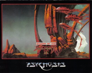
Another thing is game studio logos got made shit as well, look at things like the Psygnosis owl and the like. Studios got boring, most companies just write their fucking name on the box with no logo at all.

Avatar image for floppydics
floppydics

415

Forum Posts

0

Wiki Points

0

Followers

Reviews: 0

User Lists: 5

#25  Edited By floppydics
Member since 2014 • 415 Posts

80s and 90s box art was the greatest. Of course for every ghouls and ghosts genesis cover there is a mega man nes cover. Modern box art can be cool though that doom switch cover is sweet.

Holy shit that tlou2 box art is nasty though.

Avatar image for xantufrog
xantufrog

17875

Forum Posts

0

Wiki Points

0

Followers

Reviews: 2

User Lists: 5

#26 xantufrog  Moderator
Member since 2013 • 17875 Posts

I don't think it's changed much. Some suck, some are good.

Avatar image for legendofsense
legendofsense

320

Forum Posts

0

Wiki Points

0

Followers

Reviews: 0

User Lists: 0

#27 legendofsense
Member since 2013 • 320 Posts

I for one judge games by their covers. Who cares if the game plays like shit.

Avatar image for AcidTango
AcidTango

3221

Forum Posts

0

Wiki Points

0

Followers

Reviews: 0

User Lists: 0

#28 AcidTango  Online
Member since 2013 • 3221 Posts

The worst box arts will always be the Sega Master System games.

Avatar image for floppydics
floppydics

415

Forum Posts

0

Wiki Points

0

Followers

Reviews: 0

User Lists: 5

#29  Edited By floppydics
Member since 2014 • 415 Posts

@AcidTango: haha indeed memories of black belt and wonder boy covers flooding back to me.

Wonder boy 1, monster land and dragons trap were amazing though. Dragons trap better than original zelda even for me during 8bit.

Avatar image for vfighter
VFighter

11031

Forum Posts

0

Wiki Points

0

Followers

Reviews: 0

User Lists: 0

#30 VFighter
Member since 2016 • 11031 Posts

@AcidTango: Maybe, but even that system had a few really good ones, usually Activision games. Rampage has an awesome box on the master system.

As for the topic, box art hasn't changed, we still get some really good ones and a ton of trash, that's been pretty universal since gaming started.

Avatar image for AcidTango
AcidTango

3221

Forum Posts

0

Wiki Points

0

Followers

Reviews: 0

User Lists: 0

#31 AcidTango  Online
Member since 2013 • 3221 Posts

@floppydics:

Yeah the Sega Master System did have some good games such as Golden Axe Warrior, Alex Kidd, Phantasy Star, Master of Darkness, Ninja Gaiden (SMS version), and of course the Wonder Boy games. The Sega Master System was definitely an underrated console.

Avatar image for wiiboxstation
Wiiboxstation

1753

Forum Posts

0

Wiki Points

0

Followers

Reviews: 1

User Lists: 5

#32  Edited By Wiiboxstation
Member since 2014 • 1753 Posts

Avatar image for KungfuKitten
KungfuKitten

27389

Forum Posts

0

Wiki Points

0

Followers

Reviews: 42

User Lists: 0

#33  Edited By KungfuKitten
Member since 2006 • 27389 Posts
@wiiboxstation said:

Was going to say: I like some of my physical Switch box arts. They are very colorful and eyecatching. Most of them ooze fun. All I'm missing is a nice thicc manual inside with a control scheme and a hotline to call when I get stuck.

Avatar image for gameofthering
gameofthering

11286

Forum Posts

0

Wiki Points

0

Followers

Reviews: 4

User Lists: 0

#34 gameofthering
Member since 2004 • 11286 Posts

I miss how we always got different box arts.

Avatar image for speeny
Speeny

3357

Forum Posts

0

Wiki Points

0

Followers

Reviews: 34

User Lists: 19

#35 Speeny
Member since 2018 • 3357 Posts

You're definitely right. Sometimes less is more but in this case, I don't think so. I'm all digital now so it doesn't affect me too much.

Avatar image for uninspiredcup
uninspiredcup

58948

Forum Posts

0

Wiki Points

0

Followers

Reviews: 86

User Lists: 2

#36  Edited By uninspiredcup  Online
Member since 2013 • 58948 Posts

Related -

Loading Video...

Avatar image for deactivated-6092a2d005fba
deactivated-6092a2d005fba

22663

Forum Posts

0

Wiki Points

0

Followers

Reviews: 1

User Lists: 0

#37 deactivated-6092a2d005fba
Member since 2015 • 22663 Posts

@davillain- said:

First world problem for everyone. Except me :)

I generally don't care what the box art looks like. Just give me the damn game so I can play it to my hearts content. It's a good thing I went digital so I won't care about the box art anyway.

Just to be clear. I won't denied TLOU2 box art isn't the best, Cyberpunk 2077's for example is absolutely woeful considering the game. Some guy on a yellow background. Seriously guys, is that the best you can do? That one of the zoomed in face of Ellie isn't a good looker I've seen though, at least recently. It's bland, way too close, and just visually unappealing. But my point is, it's not something I'm gonna come to the internet and start a rant over it. Just gimme the game inside.

Interesting how you say you don't care then went on to criticize the lot of them lol.

Sounds like someone who does care.

Avatar image for deactivated-6092a2d005fba
deactivated-6092a2d005fba

22663

Forum Posts

0

Wiki Points

0

Followers

Reviews: 1

User Lists: 0

#38 deactivated-6092a2d005fba
Member since 2015 • 22663 Posts
@pyro1245 said:

Why not make your own?

AAA Publishers clearly want to spend as few resources on packaging as possible. Physical game stuff is sort of a throw back anyway.

Personally I don't care, but there are lots of good resources out there for those who do.

You're right, I remember buying a sports game where the person on the cover was a muppet, so I found a cover with players from my team and I printed it out and put it on the cover of my game. It didn't have that gloss finish but it still looked cool.