Sid Meier's Pirates! Designer Diary #1
Colead Artist Marc Hudgins explains some of the challenges involved in reimaging the world of Pirates!
Sid Meier's Pirates! is the upcoming remake to Pirates!, one of the most beloved PC games of all times. Meier, one of the industry's most noted designers, is revisiting the game he originally designed nearly two decades ago. In Sid Meier's Pirates!, you'll play as a swashbuckling sea captain in search of treasure, fame, and romance on the high seas. The game will feature a blend of exploration, puzzle-solving, role-playing, and action, which is a formula similar to the one that made the original game a classic. But this remake will also take advantage of the huge advances in computer technology that have occurred since the original. In this edition of our designer diaries, Marc Hudgins, the colead artist for the game, explains how they went about creating a new visual design for Pirates! and some of the challenges that it entailed.
A Look to Shiver Yer Timbers!
By Marc HudginsColead Artist, Firaxis Games
OK, you have to trust me on this--in my 13 years of making art in the game industry, this is the coolest and most fun experience I've ever had. Period.
I mean, come on! What is cooler or more fun than pirates? Any artist who says they would pass on an opportunity to make pirate art is either lying or a fool.
It's an opportunity to really pull out all the stops and help make the most visually stunning game possible. The theme of Pirates! provides uncommonly fertile ground for designing. It provides a whole swashbuckling world of heroes, villains, damsels, and duels with which to play.
Along with this great opportunity there are also great challenges. The first and ongoing challenge for a lead artist on any project is to discover that elusive thing called "style" or (more precisely) the "look and feel." It would be a relatively simple thing if all we had to do was figure out style for a "pirate" game: eye patch + hook + treasure map = pirates, right? Well, life isn't that simple. We don't just have any pirate game to make; we're creating Sid Meier's Pirates! The two elements, "Sid Meier" and "Pirates!," carry a lot of weight and bear heavily on the entire visual design process. The big question is, "How should a Sid Meier pirate game look and feel?" Sid brings so much to a game, not the least of which is his "tone," for lack of a better word. Part of my job is to harmonize the look and feel with Sid's vision and tone for the game.
At the beginning of any project, the first thing I look for as a lead artist is the game's tone. Is it light? Is it dark? Is it quiet or brassy? Serious or silly? Once we have properly identified the tone, the rest of the job gets a lot easier. For example, Sid's world isn't gritty, realistic, mosquito-infested, or scurvy-afflicted. Teeth are generally clean and intact, blood is rarely seen, and no one dies. In Sid's Caribbean, it's always sunny and high noon. The women (even the "plain" governor's daughters) are beautiful and the heroes are, well, heroic.
Once we have these kinds of fundamental qualities identified, we can start thinking seriously about how to communicate this world visually. The first thing I do is look for inspirational sources that are in line with the tone. That wasn't too hard for this game. Pirates! is an Errol Flynn movie or a book illustrated by Rackham, Pyle, or Wyeth. It's Technicolor. It's painterly and it's solid and simple. Wood is worn, but polished and buttery, gold is shiny yet it has a subtle patina. Every scene is beautifully lit. The sea is aqua, and the fluffy white clouds billow above rocking galleons laden with treasure. All of this was in my head before the first image was created. These qualities became the touchstones and the foundation for designing everything from characters to terrain to the interface.
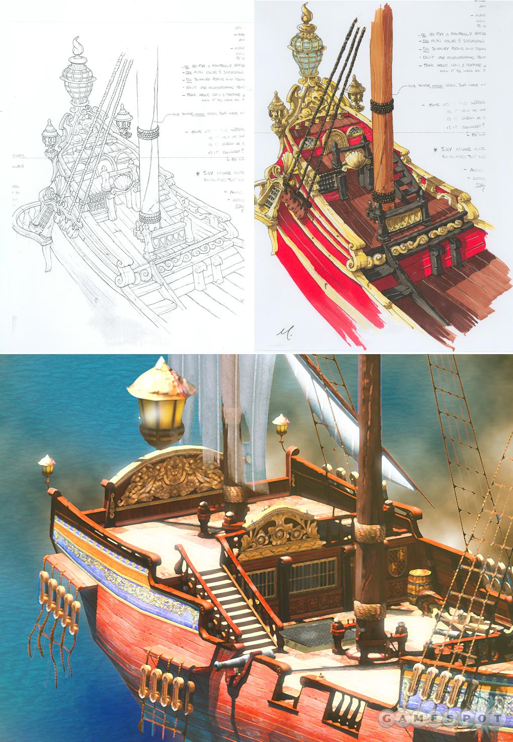
Okay, so we've identified the tone and found creative guidelines and inspiration. What's next? The fun part! Now comes the conceptual development phase, in which we start thinking about how these principles apply to specific aspects of the game. At this point we aren't making game art: we are instead visualizing what we hope the final game will look like. We make drawings, paintings, 3D renders, movies, scribbles, doodles, or whatever else gets the job done. We're spiraling in ever tighter circles on the final, tangible images that express the visual style (as opposed to the wondrous visions that have so far been locked up in our heads). Eventually we'll come up with images that will guide us toward the final game art.
Pirating Art
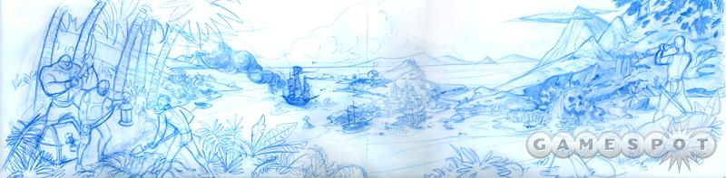
Once the conceptual development phase is completed, it's on to the work of designing the actual game elements. Pirates! is a big game with a lot of visual imagery. We have overhead map views of the Caribbean, ships, ship decks for dueling, outdoor scenes, interiors, a plethora of characters, and a fair amount of interface to consider. That is a lot of elements needing to be stitched together into a grand, unified visual design. I needed to get my head wrapped around it all, so I began to put together a large panoramic image encompassing as many of the components of the game as possible. This image covered lighting, terrain, characters, ships, and the feel of the place in general. It was truly a lovely picture and I was really getting into putting it together. Until I realized that I would probably finish it around the time the game shipped! So I reluctantly put it aside. 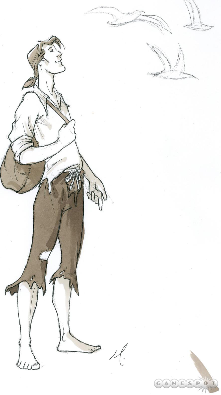
Although incomplete, getting all that stuff out of my head and on to paper was an invaluable exercise. It solidified the target style in my mind.
That done, now we could move forward and apply the style to more focused, specific subjects. We began to make concept drawings of actual game elements. As areas are conceived--characters are drawn and objects are created--one can begin to see where they fit together visually and where they have drifted from the original concept. Any drift must be corrected immediately. Are we making a solid, unified visual statement with all the elements of the game? Do they all live the same world? This is critical: A game's visual style cannot simply arise from the sum of its parts; it must be conceived and created as a whole.
Perhaps the most difficult challenge for any lead artist is to communicate the game's style to the entire team, and to make sure that in the end the game looks like it was created by one hand. The only good way to do this is by constantly talking, reviewing, and discussing the work. You meet with individual artists and groups of artists. You examine, discuss, and dissect the work in progress. You compare new assets against the ones already created. You have show-and-tell meetings. It takes a huge amount of time and energy, but this is the only way to ensure that everything stays in focus.
Every artist brings something of their style to the work they produce. We all have a personal sense of proportion, composition, and color that can be difficult to meld into a common style. The lead artist's job is to both exploit and mitigate those influences in the final art. Finding the strengths and weaknesses of the members of your team is a vital part of a lead's job. Thankfully, we've got a remarkably, talented, hardworking bunch here that makes my job a lot easier.
Reading this over, it seems that I'm spending a lot of time explaining how difficult my job is. You may begin to wonder why I'm making such a fuss about what, in the end, amounts to putting images up on a computer screen. Isn't it really the game design and coding that determine if a game is great? Sure, both of those things are important, but so is my job. No matter how good the design and programming, it's both the message--and the clarity of that message--that these images send that make the difference between an enjoyable play experience and a confused mess. Our job is to bring to life and draw you into the world that the designer has created for you. What could be more important and what could be more fun, especially when the world you're creating is Sid Meier's Pirates! Pirates! is the most fun, grand world I've ever had the privilege to work in and I'll truly miss it when it's done.
Got a news tip or want to contact us directly? Email news@gamespot.com
Join the conversation