Freedom Force Designer Diary #7
Lead designer Jonathan Chey discusses the game's interface and the challenges involved in designing it.
Entry #7 - 07/17/01
By Jonathan Chey
Lead Designer, Irrational Games
In this diary I want to touch on one of the most important elements of game design--the interface. Paradoxically, building a good game interface is usually rewarded by people not noticing what you have done. Interface is one of those things that you've generally screwed up if people pay attention to it.

The interface really should be a seamless connection between you, the game player, and the game. It should be there when you want it, serving you up whatever information you want, and it should get out of your way when you don't want it. It should also somehow allow you to directly connect to and control the game without having to think about what you are doing.
A great example of a good control interface is that of a modern car. When you drive a car, you are largely or completely unaware of what you are actually doing--pressing the brake pedal, shifting gears, and so on. Instead, you are thinking about slowing down, turning, speeding up--pretty much just as you do when you walk or run. In many ways, the car becomes an extension of your body in the same way that a prosthetic arm or leg would. A game interface is really no different--or at least a good one isn't.

Bad game interfaces are ones that require you to do extra work, don't provide you sufficient information to play the game properly, or overload you with too much information. Striking the right balance is hard.
In Freedom Force we have a bunch of things that make it hard to make a good interface. Firstly we are setting you, the player, up with quite a difficult task--controlling up to four heroes in real time in a fully 3D environment. To add to the difficulty, that 3D environment is often a city with tall buildings that obscure your view. We think we've come up with solutions to most of these problems, and I'll talk through some of those in this column. In particular, I am going to concentrate on the display interface--how we present information to you both through the rendered world and the other onscreen dialogues and menus.
So how do we show you the world and your characters in it so that it looks good and so that you have enough information to plan your actions properly? One of the biggest challenges in the Freedom Force display from day one has been camera positioning. Naturally, since this is a 3D game, people expect to be able to freely rotate and zoom the camera. Naturally also, since this is a game about larger-than-life characters, people expect to see those characters at a decent size onscreen. But these desires fight against some important gameplay elements.
In my opinion, camera zoom and rotation should not be handled by the player. Why? Because most games aren't about flying a camera around. Freedom Force, for example, is about controlling a team of superpowered heroes, not about controlling a camera. If the game was about filming the exploits of a superteam, then we might require the player to fly the camera around constantly. Otherwise, the camera controls are really a distraction from the rest of the gameplay.
Of course, computer-controlled cameras are often frustrating too because the computer is generally pretty bad at choosing what you want to be looking at. The best camera systems that I have seen are those that are tied to other user actions in an intelligent way. Take for example the usual 2D real-time strategy games. The "camera" is really just represented by the part of the map you are looking at. And that is usually controlled by pushing the mouse pointer against the side of the screen. Because the pointer is also the device that you use to select the object of interest in the world, this "just works." The next-generation 3D RTS games that included full user control of the camera rotation and zoom were, in my opinion, not such fun games because they required you to spend a lot of time working the camera--not focusing on playing the game.

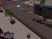
So, if the zoom level is largely fixed, how do we both show your heroes at a reasonable size and allow you to see a reasonable amount of the city? The closer the camera is, the better the characters look but the less terrain you see. And that's important in a tactical combat game because you need to see your environment as well as where your enemies are in relation to your characters. But, in a contest like this, gameplay always wins, and so our default camera zoom is relatively far out. Instead of zooming the camera in during the game, we use a number of other tools to help you get a better sense of your characters in detail including pop-up "talking heads" and camera zooming during in-game cutscenes.

The other major part of the display interface is the "metadata" that we present on top of the actual rendered worldview. A major focus for us was keeping the screen relatively clear of this kind of interface clutter. One way to do this is to design an interface that doesn't require onscreen data, like the interface in Black & White (although even there, data is occasionally printed on the screen). Another way is to add and remove this data as needed. This is the route we have followed.
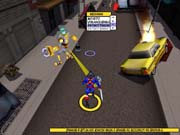
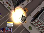
So, instead of having a large bar across one part of the screen in which we put lots of data, we have various pop-up displays that appear when needed. The most important of these is the command menu, which comes up whenever you want to issue an order to your heroes. This is a pretty standard pop-up menu that contains all the options that are relevant to the currently selected character and the current target. By only showing this data when relevant and by restricting it to the current context, we minimize onscreen clutter at other times.
Another part of the interface that comes and goes is the target or status bar. These bars pop up when a target is selected and when a power is selected, respectively. They show detailed information on the target or power so that "power users" can find out exactly how many hit points a target has, how much it weighs, or what the chance of stunning a target with the current power is.
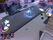
Thanks to these dynamic interface elements, the only things onscreen in the steady state are four small portraits that show the current team. That means the game looks good but also shows you the data you need when you need it.
Got a news tip or want to contact us directly? Email news@gamespot.com
Join the conversation