Extreme Game of the Year Makeovers
Publishers double-dip on their biggest hits all the time, but it's rare for Game of the Year editions to get cover art befitting the games' quality.
Earlier this week, Warner Bros. announced Batman: Arkham City Game of the Year Edition and displayed its terrifically terrible box art. We've seen some hideous packaging, but this one really goes for the gusto with its wanton disregard of anything resembling restraint. Just looking at the box, you'd be forgiven for thinking the game is actually called "10 out of 10," as that is what's most front and center on the box. However, that's Game Informer's review score.
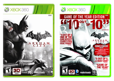
The actual name of the game--Batman: Arkham City--is written in tiny lettering and pushed all the way to the right-hand side of the box. On top of that, you really have to examine the page to see that the game packs in the all-new story-based downloadable content called Harley Quinn's Revenge, which is one of the big reasons any of the millions who already played Arkham City might be interested in this double-dip.
This got us to thinking about the best and worst game of the year/complete edition examples. We've compiled a highlighted selection here of some box art that came to mind. Let us know if you prefer the original art or the rerelease art, and which ones we missed!
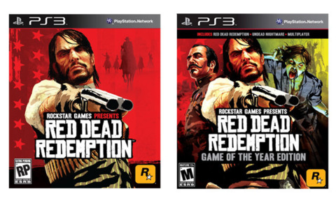
Why It's Good: The box art for Rockstar Games' open-world shooter/action game is subtle, yet very effective. It uses both text and visuals to make clear what's included in the pack, and it does so without any feeling of unnecessary self-flattery on the part of Rockstar.
And this is a big deal, considering Rockstar could have filled an entire book with critics' praising words for Red Dead Redemption, as the game boasts a very strong 95 on Metacritic. It's almost as if Rockstar is saying, "You know our game is great; we don't need those silly press quotes."
Why It's Bad: It's as if Xzibit designed the box art, saying: "Yo dawg, I heard you liked box art, so I put some box art in your box art."
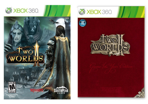
Why It's Bad: The strangest thing about this red velvet Game of the Year edition for TopWare's role-playing game is that it didn't win Game of the Year from anybody. At least, it hadn't in July of 2011, when this edition was announced. Ignoring that discrepancy and looking at the package, it's draped in red velvet, which screams, "I'm classy!" Now think of all the classy people you know, and consider how frequently they scream, "I'm classy!"
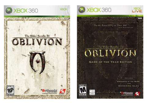
Why It's Good: Bethesda chose to take a minimalistic approach for the cover to its Game of the Year edition for Oblivion, and it worked well. For a title with such a massive in-game world, electing to be subtle with the cover really worked in its favor. The game's iconic logo and gold lettering shine brightly, and there's no confusion whatsoever regarding what's included in the pack. The pack contains only one press quote, which is also nice.
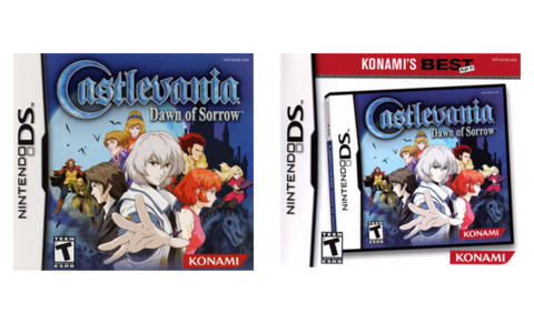
Why It's Bad: This one ups the ante from Konami's Castlevania box art by including not just one box art within box art, but four. What's even more puzzling about this art is that by stacking the four titles in front of the other, each is subsequently obscured.

Why It's Bad: Why is the soldier running through what appears to be the fire of a flamethrower? That's not a sound strategy for continued survival. Why does the mystery soldier appear to be the focus of the box art and not the three full games included in the pack?
Also, just like with Castlevania DS and the Sid Meier's Complete Edition, Activision elected to put the box art on box art. Why?!
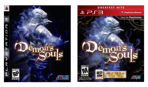
Why Our Opinion on This One Can't Be Trusted: Normally, we'd say Game of the Year editions that simply slap press accolades on the same old box art are bad, but we may have to make an exception here. Yes, the Demon's Souls greatest-hits box uses the same exact art we saw upon release, but check out that "GameSpot Best of 2009" sticker at the bottom! Clearly this package has a level of sophistication, refinement, and artful composition that the original sorely lacked. Do you think the copy desk will let us get away with a winking emoticon here? [No. --Ed.]
Got a news tip or want to contact us directly? Email news@gamespot.com
Join the conversation