@leon2365: That would be nice.
Snepstok's forum posts
Hi,
I previously ranted a bit in forums about the new design. After becoming a productive member to society again I figured a more substantive response could be of some value. One moderator said somewhere to keep posting feedback, so I tried to figure out what it was that makes my visits here feel disappointing.
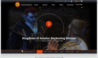
To illustrate my feeling I've added a screenshot of what I see on my screen.
I think it might be 2 things:
- The new design might not be optimized for big monitors and higher resolutions (like my 27" on 2560x1440). This is literally the 'biggest problem'. Because 50% is just a picture for a review. Even if it would be a game I'd care about, I still wouldn't need an giant pic of it. Just give me a tile (5 cm or so). Now I first have to scroll down before I begin to search for something real.
- There is no real obvious segmentation in the presentation.
- Everything feels random to me. Like how is "Top stories" any different from "Newswire". They're both recent articles.
- And above these are four boxes with even more random stuff in it: a review, an article, a video and some sort of 'portal/platform' to put articles about the new X-Box. What is what? Why not a segment for reviews, news, and 'latest articles' or something?
- Scolling down 3 times to the bottom of the page: more random stuff: a "feature", "trailer", "news", "preview". All in different sizes. I think this is messy.
A note: maybe it's because I have a select interest: pc-games. I only want to know what cool new games I haven't heard about yet are coming up (be it with news, video, preview whatnot) , and I want to know what Gamespot thinks of it, how it stacks up against the reviews from other websites and those of gamespot-members.
Note 2: I have no problem with a (random) banner or ad here and there. They're recognizable and easily filtered.
That's it.
I'm sure this new design may work out for the better, as I expect GS to actually be interested in improving the experience.
Cheers!

I know new stuff always takes time getting used to.
Having said that, this new website is horrible.

- According to Gamespot there was 'no such account' when asking for my password. Not true and yes I filled in the right email.
- As I type this, every new sentence (enter) in this field 'skips a line', looking like a complete new paragraph.
- Slooooooooow
- Reviews don't mention publisher nor developer. Not as important as the names of it's reviewer, right? Who cares a particular game was developed by John Romero. No: "KEVIN VANORD everyone, WHEEEEEEW!!!"
- Not accessible at all. Garbled mess by dividing everything by thin tiny lines.
- Just some random stuff thrown together. Why not divide by 'news', 'reviews' and 'latest' or something? (not the buttons, but actually like it used to be)
- Checking a review first shows a sceenshot in about 100% of your screen (see attached screenshot). This is insane. Scroll down again to see anything actually relevant (maybe after another "KEVIN VANORD everyone, WHEEEEEEW!!!"?)
p.s. I like Kevin, but this editor-egotrip is ridiculous. Why not relevant info first: who made it? What score did the reviewer give it, in comparison to members and other websites?
Log in to comment