Microsoft unveils new logo
Technology giant reveals first new logo change in 25 years, says users will see "common look and feel" across Windows 8, Windows Phone, Office, and Xbox services.
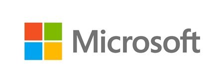
Microsoft has a new look. Today, the company unveiled its first logo change in 25 years, revealing a more colorful brand image that will be used to kick off an "incredibly exciting" year for the firm.
In an update to the official Microsoft blog, brand strategy general manager Jeff Hansen said now is the "perfect time for a change," as the company prepares to release new versions of "nearly all" of its products this year. The new logo will be a part of Microsoft's aim for a "common look and feel" across its products, including Windows 8, Windows 8 Phone, and new iterations of Office and Xbox services.
"This wave of new releases is not only a reimagining of our most popular products, but also represents a new era for Microsoft, so our logo should evolve to visually accentuate this new beginning," Hansen said in a statement.
Explaining the logo more specifically, Hansen said the logotype is a Segoe font, which is the same font the company uses in its products and marketing materials. As for the symbol, Microsoft says having a symbol is important "in a world of digital motion." The multicolored squares, Microsoft says, are intended to depict the company's "diverse portfolio of products."
The new Microsoft logo will be used "prominently" beginning today on Microsoft's official website, at its retail stores, and through its television ads and marketing materials. Hansen cautioned that making a change like this "takes time," acknowledging that the former logo may be spotted for some time.
Got a news tip or want to contact us directly? Email news@gamespot.com
Join the conversation