Finals entry
Something I did in a sudden bout of inspiration-V1
V2
Finals entry
Something I did in a sudden bout of inspiration-V1
V2
finals: nothing i can point out that i feel is flat-out wrong, but at the same time i feel like there isn't much appeal.
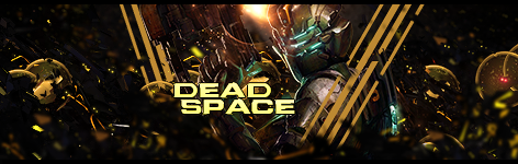
dead space: pretty f*cking awesome, no complaints.
drawn to life: drop the notebook texture but leave the notebook itself. you're going for a pop-out effect, but there are those silly lines on top of everything, even the mirror that has a freaking shadow. and those buildings feel kinda odd, like they're going against the flow in terms of depth.
Something like this?
[spoiler] 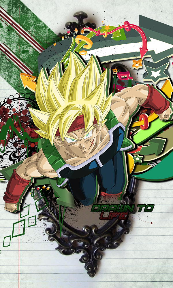 [/spoiler]
Hmmmmmmmmmmm, that mirror seems way more realistic than your cartoon effects. Seems a bit out of place?Mr_JenkinsIt was the only one I could find that I really liked.
Please Log In to post.

Log in to comment