V1-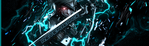 .
.
V2-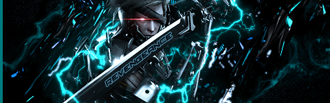
V1-.
V2-
needs wider lens flare (and not so strong that you can't see his eye under the mini-sun), that text looks bad, it's a bit too wide and raiden a bit too dessaturated.
also what the hell have you done with the sword? it looks so weird and white.
last but not least, you're late to the party :P
I haven't done anything with the sword actually.needs wider lens flare (and not so strong that you can't see his eye under the mini-sun), that text looks bad, it's a bit too wide and raiden a bit too dessaturated.
also what the hell have you done with the sword? it looks so weird and white.
last but not least, you're late to the party :P
BrunoBRS
Trying to make me jealous huh? Well...it ain't working! :P
not jealous, just pointing out that i've done it already :P
plus, if you think mine's better, you can look at it as inspiration for some improvements. i like your lightning more though, it looks plasma-y. mine on the other hand is just a really bright ice blue brush with a slightly darker blue bloom.
a trick i read on a photoshop mag to make those wide lens flares: make a new layer. fill it with black. create the lens flare. now stretch the hell out of that layer sideways, and set it to screen. voila, cinematic lens flare.
I wasn't asking if you were jealous, was trying to find out if you were trying to make me jealous lol
Think you can send that photoshop mag my way? :P
and i replied "not (trying to make you) jealous, (i'm) just pointing out that you're late" :P
i doubt it'd be much use even if i could, unless you can read portuguese. plus, i couldn't follow the tutorial that had that tip because i couldn't find the resources on the website >.> still, i read through it, and some things stuck to my head, like the "JJ abrams" lens flare trick.
Oh, my bad :P
You couldn't find the resources on another site?
well, when the tutorial makes use of specific (paid) stocks, i kinda have to rely on the magazine to give me said stocks, like they do for the other tutorials.Oh, my bad :P
You couldn't find the resources on another site?
HybridKing
of course, sometimes they give me incredibly small versions of those stocks and ask me to resize it, which works as well as you'd think >.>
And here's the edit.
Not sure if I actually nailed the lens flare trick correctly though :P
eh, V2 only solves one of my issues with the sig (which has more to do with how the effect works in the game itself). i don't think that text works, sorry :P would personally rather have it dropped.
aside from that, black and white raiden still feels odd, and i still think you could crop out the edges a bit.
Aw, kinda liked the text though :P
Oh, do you still have the render you used for your Raiden sig? Wanna try something with it.
Sweet! Thanks man.IIRC, i took it straight out of the official game page. *looks up* well it ain't there.
*uses google*
there you go, tucked somewhere inside platinum's website:
BrunoBRS
Please Log In to post.


Log in to comment