Went for an old picture look.
Went for an old picture look.
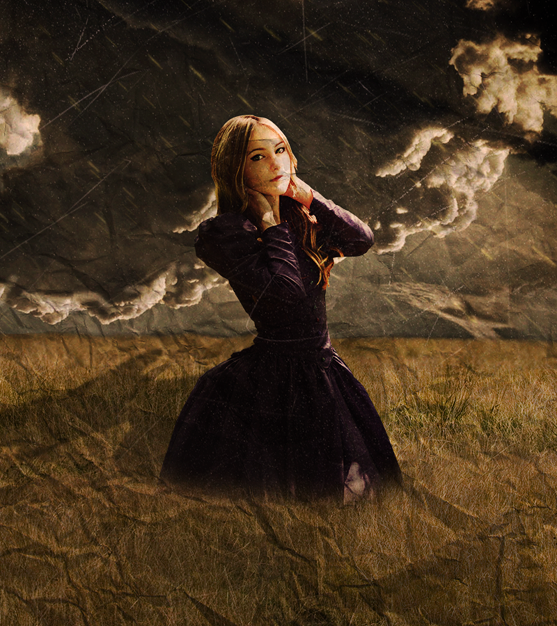
i'll say it flat out:
the blending is bad. really, really bad.
the sky and the ground are badly connected, the girl does not look like she's standing on grass, just that you've fuzzed her bottom, from the waist up she looks like a carbon cut out, very, very flat, and that shadow looks really bad and out of place.
there isn't a sense of lighting, i mean you look at the colors and you can guess where the light source should be, but the clouds and the girl's lighting contradict each other (you have to think of light in a 3D plane, a light that casts that shadow on her wouldn't cast the exact same shadow on something miles behind her). there doesn't seem to be light in the piece. i don't mean fuzzy brushes, i just mean a feeling of brightness.
you have to decide if you want to picture a sunny day (as the girl and shadow would imply), or a cloudy day (as the contrast, darkness and clouds in the background would imply). because you're lost in between the two, it comes out bad.
sorry if i sound too harsh, but that's really how i felt about it.
PS: clouds feel flat. the sky doesn't look like it has depth to it, and i think it's because, if i had to guess, the sky is actually a cloud stock, and not a sky stock taken from a horizontal plane. and there's something weird at the bottom right of the girl.
i feel like i scared hybrid away from the thread ._.BrunoBRSLol nah, I was just looking for other stuff I could use for it, can't find anything though. Wasn't planning on posting here until I made a V2 :P
Please Log In to post.

Log in to comment