Hey guys, I checked the rules before posting this and didn't see anything against requests, so if I've made a mistake, sorry, please just delete my thread.
I'm not sure how many of you know about cryptocurrencies. I've been working with several others trying to develop a logo for an alternate currency that will compete with Bitcoin in the future. This alternate currency was released about 8 months ago and is starting to gain some traction within the cryptocurrency community. It has several names, ppc, ppcoin, peercoin, p2pcoin. Whatever name is used, it basically stands for peer to peer coin. As I said though, we've been developing a logo for the last couple weeks and I think we're close to being done. The problem is that one of our graphics artists is unavailable for the time being, so we can't continue our work.
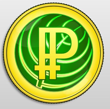
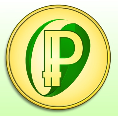
Here is some background info on the coin to help understand the logo design better. The process of mining Bitcoin requires a lot of electricity. Peercoin was developed to fix this problem by making a more eco-friendly coin which requires much less electricity. We've decided to incorporate a leaf into the logo design to represent the eco-friendliness of the coin. Below you can see how the logo concepts have evolved over the last couple weeks...


This is where I need help if possible. This is our latest design. We feel we're getting close to a finished design...

A different graphics designer posted these two versions recently...
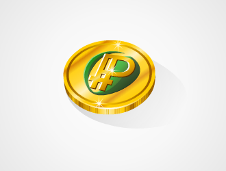
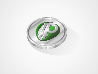
This is my problem. We love the design with the rim around the outside of the coin that says "Peer to Peer" and "Cryptocoin." We feel however that the color could be a lot better. It's supposed to be gold, but it looks more like it's bronze. We love the color, reflection and sparkle of the last two coins though, the gold and silver ones.
What I need is two versions. Both versions will use the design with the text around the outside of the coin. Both versions will use the PP symbol without the large space in between (The symbol in the silver coin, not the gold one, notice the difference). Both versions will remove the year 2012 from the coin, since it's not needed. Both versions will be a face down view of the coin, not at an angle unless you wanted to make them also. Larger images are preferred over smaller ones. We can resize them if necessary. The main difference is that one version will use the shiny gold color pictured above and the other will use the shiny silver color.
If anyone can help me here with this I'd really appreciate it. If I've confused anyone about what I'm looking for and you need clarification, just let me know. Thanks!
Log in to comment