New Article Layout Feedback Thread - Keep it Here (Updated 12/4)

  • 115 results
  • 1
  • 2
  • 3

This topic is locked from further discussion.

Avatar image for Shadow4020
Shadow4020

2097

Forum Posts

0

Wiki Points

0

Followers

Reviews: 0

User Lists: 0

#1  Edited By Shadow4020
Member since 2007 • 2097 Posts

Updated by @LarkAnderson to raise the visibility of this response:

Thanks for all the feedback, this has been super helpful!

As some of you have pointed out, these changes have been in the works for some time now--this has actually been how the newsreading experience has worked for signed out users since E3. After making a few tweaks, most notably the addition of comment upvoting (which will be fixed today, by the way!), we made the decision to release this to everyone.

As for why we've made these changes, what we're trying to do here is make it easier for our users to read articles by letting them transition seamlessly from one into the next. With this layout, we also wanted to reduce some of the clutter in and around the articles by removing the right column and the "skin" ads that box in the content, and adding in more whitespace. This type of newsreading experience is increasingly commonplace, and variations of it can be seen right now on sites such as ESPN, Time, and the AV Club.

That said, we hear you loud and clear, and we'll be making further adjustments based on your feedback in the immediate future:

  • The sticky footer bar that shows what other content is coming up next will be removed DONE on 12/3
  • The button to expand comments will be moved above the Yahoo unit, just below the large Upvote button to place more emphasis on them and reduce the chance to scroll past and miss them DONE on 12/3
  • The comments link at the top of the article will be changed so it expands the comments and moves you to them Done on 12/17
  • Reply notifications will be fixed so they link correctly to comments Done on 12/17
  • We will fix a bug that should remove the CSRF-related error reported by @mesome713 Done on 12/11

Thanks again for the feedback!

I didn't like this layout in the past and I don't like it now. When I see articles I want to read I open them in different tabs from the main page, I don't need an annoying bar on the bottom of my screen following me around and taking up space. And it has managed to become less intuitive than the old layout, because if I want to see the comments I have to click a button, whereas before I could just see them by scrolling down. I can see what you're trying to do, but I don't need random articles attached to the ones I care about.

And if you're going to insist on this suggestion bar of articles, might I suggest placing it in the margins to the left or right of the article at least?

Just my two cents.


Stickied and had headline changed by Admin

~DD
Avatar image for Jasurim
Jasurim

507

Forum Posts

0

Wiki Points

0

Followers

Reviews: 43

User Lists: 0

#2  Edited By Jasurim
Member since 2013 • 507 Posts

I'd like to add my support to your suggestions/feedback.

The new layout in my opinion, is rather obnoxious. It's off-putting having those extra article suggestions constantly taking up the bottom of my screen, I second the suggestion to add them to the side instead or alternatively, give me the option to minimise that little suggestions scroll box. I also prefer having the comments automatically at the bottom of the page as opposed to the never ending loading of new articles. If I wanted to read those articles I would have clicked on those ones in the first place.

Avatar image for davillain
DaVillain

56040

Forum Posts

0

Wiki Points

0

Followers

Reviews: 0

User Lists: 5

#3 DaVillain  Moderator
Member since 2014 • 56040 Posts

*Was about to make a thread on the new layout articles but since you'll already have it up, I'll add mt feedback as well*

This new layout to me is too obnoxious, it is hard for me to read the article when there's too much extra stuff that I'm not interested in the first place. Loading up the comment, that shouldn't be happening at all. Like @Jasurim stated, if I want to read another article and not seeing extra articles, I would have just click on those pages myself, I don't need the extra page when I click the soul purpose of reading that particular article.

Avatar image for shalashaska_
shalashaska_

204

Forum Posts

0

Wiki Points

0

Followers

Reviews: 4

User Lists: 0

#4  Edited By shalashaska_
Member since 2015 • 204 Posts

I agree the layout is really bad, I think it should be its own page instead of the scroll. On news sites I usually look at the main page and tab any article that peaks my interest. I dont want to be forced to look at other articles...

Avatar image for suicidesn0wman
suicidesn0wman

7490

Forum Posts

0

Wiki Points

0

Followers

Reviews: 10

User Lists: 0

#5 suicidesn0wman
Member since 2006 • 7490 Posts

@davillain-: Ditto for me, no need to start a new thread, gamespot is already pissed at me. lol

The new layout is causing a lot of troubles for me, screen is stuttering and stuff, couldn't even scroll a page it was screwing up so hard. I didn't like the version they tried to force on us months ago, and I like this version even less. It's like they're trying to use ajax to shovel more ads down our throats by loading extra pages.

Avatar image for madsnakehhh
madsnakehhh

18252

Forum Posts

0

Wiki Points

0

Followers

Reviews: 4

User Lists: 0

#6 madsnakehhh
Member since 2007 • 18252 Posts

Same here, i'm really disliking the bottom bar, is so distracting and it makes the page looks unfocused...i would really like a more cleaner look and like Op said, if you want to recommend more articles, you definitely should use the right side because i insist, its so distracting and it looks bad.

Avatar image for Thanatos2k
Thanatos2k

17660

Forum Posts

0

Wiki Points

0

Followers

Reviews: 1

User Lists: 0

#7  Edited By Thanatos2k
Member since 2004 • 17660 Posts

It looks like it was made for mobile phones. Giant empty swaths of space and text crammed in the middle of the screen. Looks like crap on bigger screens. There's bars floating over both the top and bottom now. The bottom bar is especially distracting and results in misclicking into places you don't want to go.

Also comments now need a click to open, which is awful. Clicking on replies used to jump directly to the comment but that's now broken. And the infinite stream is unwanted and unneeded.

Avatar image for TJDMHEM
TJDMHEM

3260

Forum Posts

0

Wiki Points

0

Followers

Reviews: 0

User Lists: 0

#8 TJDMHEM
Member since 2006 • 3260 Posts

I don't like it either.

Avatar image for byshop
Byshop

20504

Forum Posts

0

Wiki Points

0

Followers

Reviews: 11

User Lists: 0

#9 Byshop  Moderator
Member since 2002 • 20504 Posts

Can't say I'm a huge fan either. I thought the old layout was fine.

-Byshop

Avatar image for snugglebear
snugglebear

5015

Forum Posts

0

Wiki Points

0

Followers

Reviews: 17

User Lists: 0

#10 snugglebear
Member since 2004 • 5015 Posts

I'd like the old layout back. I'm not enjoy this one at all.

Avatar image for fraggkitten
fraggkitten

59

Forum Posts

0

Wiki Points

0

Followers

Reviews: 0

User Lists: 0

#11 fraggkitten
Member since 2011 • 59 Posts

As someone who lurks about at what people are talking about a LOT in the comments section, this just made things very, very difficult for me. It's starting to feel like it's only a matter of time before they just get rid of the comments all together. :/

Avatar image for Acillatem1993
Acillatem1993

1100

Forum Posts

0

Wiki Points

0

Followers

Reviews: 1

User Lists: 0

#12 Acillatem1993
Member since 2011 • 1100 Posts

The new layout is quite horrible. Not only does it look bad, its hard checking comments too. I also doubt that anyone really sees it as useful in any way.

Avatar image for uninspiredcup
uninspiredcup

58854

Forum Posts

0

Wiki Points

0

Followers

Reviews: 86

User Lists: 2

#13  Edited By uninspiredcup
Member since 2013 • 58854 Posts

I actually thought was Firefox bugging out, apparently not.

And yea, comments are a chore now, a massive part of the screen taken up with something I could easily navigate ON THE FRONT PAGE.

Avatar image for digitaldame
digitaldame

5401

Forum Posts

0

Wiki Points

0

Followers

Reviews: 8

User Lists: 2

#14  Edited By digitaldame
Member since 2006 • 5401 Posts

@TJDMHEM: Can you elaborate?

@Acillatem1993: Can you be specific?

@snugglebear:What about this new layout are you not enjoying specifically.

(Please note that my questions are not meant to imply that I disagree with your insights. It's just that, for the purposes of sharing said feedback, the more detailed the information is the better.)

Avatar image for uninspiredcup
uninspiredcup

58854

Forum Posts

0

Wiki Points

0

Followers

Reviews: 86

User Lists: 2

#15  Edited By uninspiredcup
Member since 2013 • 58854 Posts

Already had a bar at the top for navigation, I don't understand the point.

A drop down menu, or side swipe menu, only popping out when the cursor hovers over it probably would have been less intrusive.

Haven't jumped on the tablet yet, but if assuming it works the same on a 7-10inch screen, that will be super annoying.

Avatar image for nothingformoney
NothingForMoney

466

Forum Posts

0

Wiki Points

0

Followers

Reviews: 0

User Lists: 5

#16 NothingForMoney
Member since 2014 • 466 Posts

I don't like having multiple news in one page. I hate when I scroll down to the bottom and a random news automatically pops out. It's annoying.

I don't like all the empty spaces on the right side of the article.

I'll think of some more.

Avatar image for RossRichard
RossRichard

3738

Forum Posts

0

Wiki Points

0

Followers

Reviews: 0

User Lists: 0

#17 RossRichard
Member since 2007 • 3738 Posts

Please bring back the old style.

Avatar image for TJDMHEM
TJDMHEM

3260

Forum Posts

0

Wiki Points

0

Followers

Reviews: 0

User Lists: 0

#18 TJDMHEM
Member since 2006 • 3260 Posts

@digitaldame there are multiple articles and you have to click a button to see the comments.

Avatar image for digitaldame
digitaldame

5401

Forum Posts

0

Wiki Points

0

Followers

Reviews: 8

User Lists: 2

#19 digitaldame
Member since 2006 • 5401 Posts

@RossRichard: What was it about the old style that you prefer? (Again, not taking sides, just trying to grab feedback.)

Avatar image for cornbredx
cornbredx

1879

Forum Posts

0

Wiki Points

0

Followers

Reviews: 20

User Lists: 0

#20 cornbredx
Member since 2004 • 1879 Posts

I just think the comments section is weird and looks ugly. It's also feels less intuitive, more burdensome. It has more clicks to load comments, which I have to click every time, and there is a weird empty bordered box just below it for some reason. I guess this a good way to keep the nasty comments at bay from people but cowboys like me who like to risk it find it a bit of a nuisance the way it is now. Is there a middle ground somewhere? Maybe an option to toggle it always open or something so I don't have to click to open it every time?

The pictured links at the bottom of the screen are ugly looking, but I get what you're going for (making the site more tablet friendly- I get it). I agree it takes up too much space. Maybe have it only appear on screen at the bottom of the article, around the comments section, or something.

Avatar image for deactivated-5dda2d3e36ec5
deactivated-5dda2d3e36ec5

48

Forum Posts

0

Wiki Points

0

Followers

Reviews: 0

User Lists: 0

#21 deactivated-5dda2d3e36ec5
Member since 2015 • 48 Posts

Me too I hate this shitty new layout. Change it please.

Avatar image for RogerioFM
RogerioFM

10534

Forum Posts

0

Wiki Points

0

Followers

Reviews: 0

User Lists: 0

#22 RogerioFM
Member since 2005 • 10534 Posts

Uh, I hate that bottom menu,

Avatar image for digitaldame
digitaldame

5401

Forum Posts

0

Wiki Points

0

Followers

Reviews: 8

User Lists: 2

#23 digitaldame
Member since 2006 • 5401 Posts

@gous: I get that you're not a fan, but when you're sharing feedback if you could be more specific that'd be great.

Avatar image for snugglebear
snugglebear

5015

Forum Posts

0

Wiki Points

0

Followers

Reviews: 17

User Lists: 0

#24 snugglebear
Member since 2004 • 5015 Posts

@digitaldame: No problem! I don't like how easy it is to scroll past what you're trying to find, how jumbled the new format makes the stories you're reading look, the comments not feeling attached to the bottom of the stories, and that bar along the bottom just clutters things up. It feels more like I'm being rushed past the content i want.

Avatar image for deactivated-58ce94803a170
deactivated-58ce94803a170

8822

Forum Posts

0

Wiki Points

0

Followers

Reviews: 7

User Lists: 0

#25  Edited By deactivated-58ce94803a170
Member since 2015 • 8822 Posts

This new style is broken, notifications dont work on it. And i keep getting errors now on certain ones after i post a few times. I can post on the others ones now, just cant post on the ones i already have. Seems like its gone cray cray.

Its happened in two forums now. Cant reply to people who have replied to my previous comments. I dont think i want to continue to post on front page if i cant reply to people, thats insulting to others. Forgive me those who i cant reply too.

@davillain-: Forgive me, i couldnt reply to your comment, the new comment section wont let me reply now. But i agree, i hope NX will bring new support and give us a brighter future.

Avatar image for 93ChevyNut
93ChevyNut

1396

Forum Posts

0

Wiki Points

0

Followers

Reviews: 0

User Lists: 0

#26 93ChevyNut
Member since 2012 • 1396 Posts

I certainly understand changing formats to keep things fresh, but it's equally important that the changes are actually improvements. The story below the one I'm currently reading as well as the string of boxes at the bottom of the screen only seems to clutter my screen. Furthermore, narrowing the comments section uses less of my widescreen monitor's real estate (although I could see that being beneficial for mobile platforms). For what my 2 cents is worth, I don't care for the changes.

Respectfully,

93ChevyNut

Avatar image for alaindc
alaindc

77

Forum Posts

0

Wiki Points

0

Followers

Reviews: 5

User Lists: 0

#27 alaindc
Member since 2003 • 77 Posts

I HATE the new article layout. The menu at the bottom take too much space, and clutter the screen.

We have the black gamespot bar at th top, and this articles menu at the bottom, so we don't have enough space to read the article, specially if we use big font. If you want a news menu, put it on the right of the screen, we have WIDE monitor.

To put it short, IF the new menu is here to stay, i won't go to this site anymore.

Avatar image for byshop
Byshop

20504

Forum Posts

0

Wiki Points

0

Followers

Reviews: 11

User Lists: 0

#28 Byshop  Moderator
Member since 2002 • 20504 Posts

Too easy to scroll past the article you're reading, getting to comments now requires a second click, and I don't see the advantage of making all the articles one big scroll versus the old display method.

-Byshop

Avatar image for Kuromino
Kuromino

1602

Forum Posts

0

Wiki Points

0

Followers

Reviews: -2

User Lists: 9

#29 Kuromino
Member since 2009 • 1602 Posts

@uninspiredcup said:

A drop down menu, or side swipe menu, only popping out when the cursor hovers over it probably would have been less intrusive.

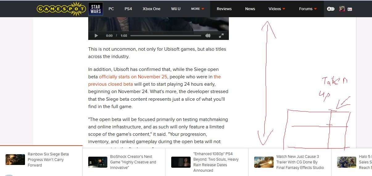
This sounds like a better idea, that bar at the bottom is pretty distracting. The amount of empty space in the articles now is ridiculous (see the picture posted by uninspiredcup). Why is the article so squashed?

Avatar image for jimy1475
jimy1475

1228

Forum Posts

0

Wiki Points

0

Followers

Reviews: 3

User Lists: 0

#30 jimy1475
Member since 2008 • 1228 Posts

who was thinking it was a good thing to do, can they post it to show to people and get the feedback before adding

Avatar image for Acillatem1993
Acillatem1993

1100

Forum Posts

0

Wiki Points

0

Followers

Reviews: 1

User Lists: 0

#31 Acillatem1993
Member since 2011 • 1100 Posts

@digitaldame: I am bothered by many things. The bar itself being there just takes up space on the screen so I see less text at a time, which irritates me. Then theres the lag that happens when you get to the end of an article and another one starts loading. That lag can cause me to scroll past comments. And speaking about comments, I need to load them every time I see. Not much of an issue, just annoying. Also since I see all the articles on the front page anyway (and theres not that many new ones to begin with to be honest) it seems necessary to have this new system.

Avatar image for RossRichard
RossRichard

3738

Forum Posts

0

Wiki Points

0

Followers

Reviews: 0

User Lists: 0

#32 RossRichard
Member since 2007 • 3738 Posts

@digitaldame: The old style was minimalist and didn't bombard your eyeballs with crap.

Avatar image for ______
______

297

Forum Posts

0

Wiki Points

0

Followers

Reviews: 0

User Lists: 0

#33  Edited By ______
Member since 2015 • 297 Posts

Wow, I can't believe someone actually thought this new layout is not garbage, enough even to take it live. A couple of points to consider:

1. The most important thing, the article, takes about 20% of screen space, while the other 80% are taken up by either empty space or useless crap.

2. Useless crap (aka the bottom panel):

3. Like it was mentioned here already, people often open articles they're interested in new browser tabs. Now you're shoving down our throats the unwanted articles every time we open the ones we like.

Avatar image for digitaldame
digitaldame

5401

Forum Posts

0

Wiki Points

0

Followers

Reviews: 8

User Lists: 2

#34 digitaldame
Member since 2006 • 5401 Posts

@RogerioFM: Can you be specific? Just want to make sure.

Avatar image for jonexotic
JonExotic

411

Forum Posts

0

Wiki Points

0

Followers

Reviews: 0

User Lists: 0

#35 JonExotic
Member since 2015 • 411 Posts

@Shadow4020:

Bring back the old layout.

Avatar image for digitaldame
digitaldame

5401

Forum Posts

0

Wiki Points

0

Followers

Reviews: 8

User Lists: 2

#36 digitaldame
Member since 2006 • 5401 Posts

@jonexotic: Can you elaborate on what about the old layout you liked?

Avatar image for off3nc3
off3nc3

1005

Forum Posts

0

Wiki Points

0

Followers

Reviews: 33

User Lists: 0

#37 off3nc3
Member since 2005 • 1005 Posts

Ok so what's up with the new website layout ? It looks so cluttered and annoying . What brought this change ? Is it a bug or ? Been a member for way too long on GS , never have i seen such a bad layout before.

my 2c

Avatar image for shalashaska_
shalashaska_

204

Forum Posts

0

Wiki Points

0

Followers

Reviews: 4

User Lists: 0

#38  Edited By shalashaska_
Member since 2015 • 204 Posts

@Byshop said:

Too easy to scroll past the article you're reading, getting to comments now requires a second click, and I don't see the advantage of making all the articles one big scroll versus the old display method.

This, plus the fact the bar and centered space makes it really cluttered. The scrolling is awful, im surprised gs is trying to bring it back. I dont think anybody liked it last time either...

Avatar image for jonexotic
JonExotic

411

Forum Posts

0

Wiki Points

0

Followers

Reviews: 0

User Lists: 0

#39  Edited By JonExotic
Member since 2015 • 411 Posts

@digitaldame:

It was simple, and I didnt have to click a button to open up the comments.

Avatar image for RogerioFM
RogerioFM

10534

Forum Posts

0

Wiki Points

0

Followers

Reviews: 0

User Lists: 0

#40  Edited By RogerioFM
Member since 2005 • 10534 Posts

@digitaldame said:

@RogerioFM: Can you be specific? Just want to make sure.

When you click on an article, below there is a sliding part where you can choose other news.

Avatar image for deactivated-6274711eaf5c1
deactivated-6274711eaf5c1

118

Forum Posts

0

Wiki Points

0

Followers

Reviews: 27

User Lists: 0

#41 deactivated-6274711eaf5c1
Member since 2005 • 118 Posts

Came here to complain about that bottom bar too.

Trying to read articles, when all you can see are three sentences is really obnoxious. Read sentence, scroll, sentence scroll... If you can speed read, it is even more annoying. And that bar doesn't even point to a article I want to click on either. Really really useless addition.

Avatar image for larkanderson
larkanderson

2227

Forum Posts

0

Wiki Points

0

Followers

Reviews: 17

User Lists: 7

#42 larkanderson
Member since 2004 • 2227 Posts

Hey all,

Thanks for all the feedback, this has been super helpful!

As some of you have pointed out, these changes have been in the works for some time now--this has actually been how the newsreading experience has worked for signed out users since E3. After making a few tweaks, most notably the addition of comment upvoting (which will be fixed today, by the way!), we made the decision to release this to everyone.

As for why we've made these changes, what we're trying to do here is make it easier for our users to read articles by letting them transition seamlessly from one into the next. With this layout, we also wanted to reduce some of the clutter in and around the articles by removing the right column and the "skin" ads that box in the content, and adding in more whitespace. This type of newsreading experience is increasingly commonplace, and variations of it can be seen right now on sites such as ESPN, Time, and the AV Club.

That said, we hear you loud and clear, and we'll be making further adjustments based on your feedback in the immediate future:

  • The sticky footer bar that shows what other content is coming up next will be removed
  • The button to expand comments will be moved above the Yahoo unit, just below the large Upvote button to place more emphasis on them and reduce the chance to scroll past and miss them
  • The comments link at the top of the article will be changed so it expands the comments and moves you to them
  • Reply notifications will be fixed so they link correctly to comments
  • We will fix a bug that should remove the CSRF-related error reported by @mesome713

Thanks again for the feedback!

Avatar image for harry_james_pot
harry_james_pot

11414

Forum Posts

0

Wiki Points

0

Followers

Reviews: 5

User Lists: 0

#43 harry_james_pot  Moderator
Member since 2006 • 11414 Posts
  • We already have the navigation and search bars at the top, and now the huge article bar at the bottom. Add to that all the empty spaces on both sides, and the article content itself is now squished into this box in the middle of the screen. I have a 27" monitor and it feels like I'm on my phone.
  • If I wanted to read the other articles I would've clicked on them. Having that endless stream of them is very distracting and pretty much useless.
  • We now need to click a button to have the comments show up. Yes, it's just one extra click, but extra clicks are never a good thing.

I don't see how this update improves the site's browsing experience in any way, it just makes things worse.

Avatar image for deactivated-58ce94803a170
deactivated-58ce94803a170

8822

Forum Posts

0

Wiki Points

0

Followers

Reviews: 7

User Lists: 0

#44  Edited By deactivated-58ce94803a170
Member since 2015 • 8822 Posts

@LarkAnderson: Thanks for the quick updates, good luck on yalls work.

@digitaldame: Also thanks for monitoring the comments and helping route people to the bug reporting forum so we could voice our opinions on the matter. Was a great service and much appreciated.

Avatar image for digitaldame
digitaldame

5401

Forum Posts

0

Wiki Points

0

Followers

Reviews: 8

User Lists: 2

#45 digitaldame
Member since 2006 • 5401 Posts

@mesome713:

Avatar image for shadowchronicle
Shadowchronicle

26969

Forum Posts

0

Wiki Points

0

Followers

Reviews: 66

User Lists: 0

#46 Shadowchronicle
Member since 2008 • 26969 Posts

Odd question is it possible to make it a feature you can turn off and on?

Avatar image for davillain
DaVillain

56040

Forum Posts

0

Wiki Points

0

Followers

Reviews: 0

User Lists: 5

#47 DaVillain  Moderator
Member since 2014 • 56040 Posts

@mesome713: I just wanted to say thanks for your reply. I honestly didn't receive my notification until I saw your reply to me in this thread just now. My notifications do sometimes work and it doesn't, so I won't know who's replying to me for the most parts.

Avatar image for dantesergei
dantesergei

2254

Forum Posts

0

Wiki Points

0

Followers

Reviews: 5

User Lists: 0

#48 dantesergei
Member since 2004 • 2254 Posts

I prefer the old layout back, it kept things simple.

Avatar image for shalashaska_
shalashaska_

204

Forum Posts

0

Wiki Points

0

Followers

Reviews: 4

User Lists: 0

#49 shalashaska_
Member since 2015 • 204 Posts

@LarkAnderson said:

As for why we've made these changes, what we're trying to do here is make it easier for our users to read articles by letting them transition seamlessly from one into the next.

What if I dont want to transition to another one and only want to read the one I clicked on...

Avatar image for mairsil
mairsil

33

Forum Posts

0

Wiki Points

0

Followers

Reviews: 1

User Lists: 0

#50 mairsil
Member since 2005 • 33 Posts
@LarkAnderson said:
As for why we've made these changes, what we're trying to do here is make it easier for our users to read articles by letting them transition seamlessly from one into the next.

Here is the biggest problem with that approach: you assume that people WANT to transition to other articles. On average, I read about 3-5 articles per day here. These are typically not consecutive articles, nor are they topically related. People do NOT read articles like this; they read an RSS feed like this.

As evidenced by those above me, the site is once again trying to throw out the baby with the bath water. People come here to read articles and read the (ranging from psychotic to hilarious) comments on the articles. If you want to disable comments, just do it. Hiding them and making them more difficult to get into is a very poor practice.

@LarkAnderson said:
This type of newsreading experience is increasingly commonplace, and variations of it can be seen right now on sites such as ESPN, Time, and the AV Club.

And if everyone else jumped off a cliff would you too? :)

Seriously though, this is not a good reason. Have you done any usability analysis, A/B testing, surveys or any other research as to what the impact for the site and its users would be? I have yet to see a neutral opinion on this change here, let alone a positive one. The last time this change was "tested" on us, it was also lambasted. While I am glad that opinions are being solicited now, once again, it is being done after the fact.

Let me ask you a simple question: do you read articles this way? Why? Do you enjoy scrolling past an article that doesn't interest you in order to see if the next one does?

I imagine the most people here visit once a day (for me, once dinner). You are going to get much more ad exposure from people viewing the news listing page and individually opening and viewing the articles they want to read. Doing an infinite scroller like you have now is going to lead to reader fatigue and attrition.

Also, as a final piece of feedback, let us downvote articles. Hide the downvotes if you want, but let us give you feedback that we don't like certain games/articles/writers in some way. Upvotes without downvotes is pointless and everyone sees that.