Change to GameSpot Navigation Interface
This topic is locked from further discussion.

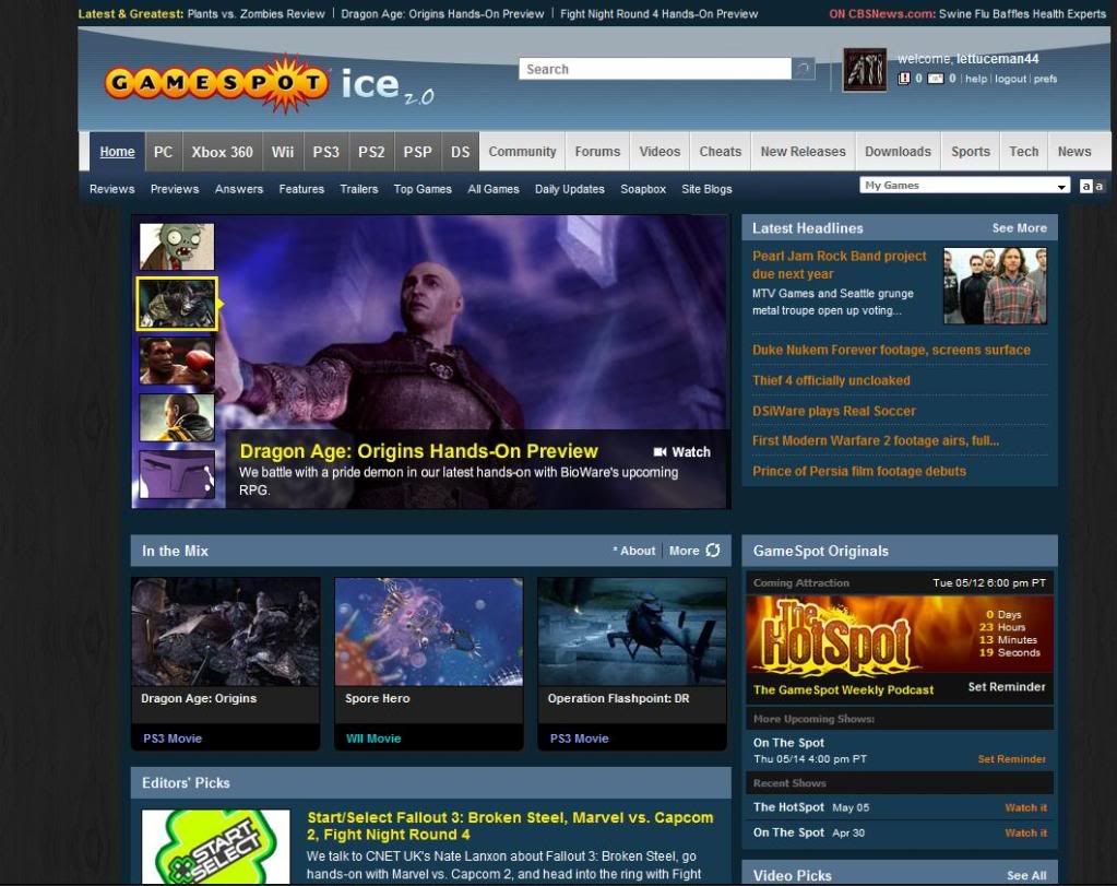
That My Games dropdown is nice and all, but it only lists the first ten games in my tracked list in alphabetical order. That's nice I guess, but I'd prefer some other ordering that doesn't force me to view the whole list just because the game I want doesn't start with A or B. I'm not saying you should show the whole list, but maybe sort them by popularity or most recent update.LordAndrewI've been reliably informed (thanks megagood) that the old behaviour will soon return.

It's waaaay too bright. I mean,it's fine if you used the lighter theme to begin with, but if you used the darker it's a bit too bright. It would be better if you were able tone it down a little.
Good change, I always accidentally clicked on a news when trying to use the search function. Wondering though, I can't see the "Features" tab anymore, how do I get to that section for stuff like the HotSpot?BenderUnit22I always just go directly to gamespot.com/hotspot. And unless the Features link gets added back, it like everyone else may have to do that as well. :( I would have just edited this into my latest post, but I can't access the page it's on. So you get this new post instead.

[QUOTE="BenderUnit22"]Good change, I always accidentally clicked on a news when trying to use the search function. Wondering though, I can't see the "Features" tab anymore, how do I get to that section for stuff like the HotSpot?LordAndrewI always just go directly to gamespot.com/hotspot. And unless the Features link gets added back, it like everyone else may have to do that as well. :( I would have just edited this into my latest post, but I can't access the page it's on. So you get this new post instead. A link to the Hotspot can be found under News.
[QUOTE="BenderUnit22"]Good change, I always accidentally clicked on a news when trying to use the search function. Wondering though, I can't see the "Features" tab anymore, how do I get to that section for stuff like the HotSpot?LordAndrewI always just go directly to gamespot.com/hotspot. And unless the Features link gets added back, it like everyone else may have to do that as well. :( I would have just edited this into my latest post, but I can't access the page it's on. So you get this new post instead.Yeah, but it's not exactly good site design if you have to use a direct url or Google to access parts of a site. Also, people who don't know that the HotSpot exists will never stumble across it this way. GameSpot lost a few other features this way with the old redesign as well, I believe there was and is no way to get to their old "Greatest Games of All Time" feature via the site
[QUOTE="LordAndrew"][QUOTE="BenderUnit22"]Good change, I always accidentally clicked on a news when trying to use the search function. Wondering though, I can't see the "Features" tab anymore, how do I get to that section for stuff like the HotSpot?dab198I always just go directly to gamespot.com/hotspot. And unless the Features link gets added back, it like everyone else may have to do that as well. :( I would have just edited this into my latest post, but I can't access the page it's on. So you get this new post instead. A link to the Hotspot can be found under News.Ah, thanks a ton. Would probably make more sense as a "Community" feature IMO.

Good change, I always accidentally clicked on a news when trying to use the search function. Wondering though, I can't see the "Features" tab anymore, how do I get to that section for stuff like the HotSpot?BenderUnit22I hope the features page isn't gone...I loved that page!
It's fine except it's too white. You need to make an option for it to go with the dark theme.
I think the opinion of the vast majority of GS is pretty much obvious now. Just go to OT and look at the thread there. I hate it too - it's just stupid and obnoxious imo. Also, could we get markop's request in the thread he made (which was locked) seen to? The one asking if we could have the old version in use for GS Ice users? I'm one, and I hate having to look at an orange and white GS tbh. >_>KOTORkicker
I have ice themed GS right now. Check it out :P
The power of firefox.

There's too much contrast between the upper portion of the site and the rest if you're using the dark background. It looks like there's a totally different thing attached to the top of the page. :?guthwulf_deI agree. It also makes it hard to see if you have messages or not.
I need Sunglasses on the Site now.Whoa! this is Bright.

OK, the changes, instantly... not cool, just not...
It took less than a minute to annoy the heck out of me.
Anyway, it will stay this way anyway.
All I'd say is, indeed (as said before) make the bar in the top darker or something.
Maybe, I don't know, make it the same black as in the "dark theme" when you use that one.
Alsooo... the previous games-dropdown was indeed not all great.
Personally it always just took too long to load the "feeds" or updates or whatever.
Which I didn't use anyway, I just wanted to jump to my games.
However, even though now it's been thinned down to just showing the games,
it just shows 10 and then lastly "show all".
Can't it go back to like the full list with a scroll-bar or something like that?
Before I clicked the "show all"-link, I thought it would expand the list to show all titles.
But instead it just went to the "My Games"-page, which takes just as long as the previous version again.
For the rest it's alright I guess.
As long as it's easy to navigate (quickly) and it looks clean and tidy, is all I care about. :)
Can I also request that the PM inbox and update buttons be switched back round to having the PM link on the left hand side, with the udpates on the right? I don't know why that was changed around, but it's weird for me :(Caddy06_88I agree. Also I don't like the change. It's way too bright. :( Not cool GameSpot. :?
I for my part consider the site changes more or less suboptimal, to be honest ...
That the "My Games"-pulldown isn't directly beneath my user-data is confusing because it kinda disrupts the navigation. Moreover the change of the section headers isn't really of advantage because now the platform-sections are only separated by another color ... And last but not least it's a pity that the "Latest & Greatest"-section was downgraded to three tiny teasers instead of the old preview-function with teaser-pictures in it.
You know, I was just thinking:
What would be even better, if the display was like modular.
That you could just drag buttons and modules of course to wherever the user wants them to be.
If not that, maybe there could be more settings/options added in the "prefs".
So maybe you could set each button whether to show or not, positions in which "bar" and for example "left/right or center".
Just a thought.
Might need a while to get to that, but I don't think you'd need to overhaul the entire website.
I'm trying to think of where I saw something similar and it worked really well...
the change is great. i like it.
Can I also request that the PM inbox and update buttons be switched back round to having the PM link on the left hand side, with the udpates on the right? I don't know why that was changed around, but it's weird for me :(Caddy06_88I'm going to have to second this, I don't like how the PM icon and update icon have been switched. Also, what happened to the little expand thing that showed you recent updates?
[QUOTE="KOTORkicker"]I think the opinion of the vast majority of GS is pretty much obvious now. Just go to OT and look at the thread there. I hate it too - it's just stupid and obnoxious imo. Also, could we get markop's request in the thread he made (which was locked) seen to? The one asking if we could have the old version in use for GS Ice users? I'm one, and I hate having to look at an orange and white GS tbh. >_>lettuceman44
I have ice themed GS right now. Check it out :P
The power of firefox.
I noticed that too but when i used it the extra boxes on the forum page (friends, my unions) had disappeared
Here's a question - will all this (mostly negative) feedback result in any changes to the header?
Let's hope so. My problem isn't with the header itself, I actually like the new design, it's just that it's far too bright for the dark version of the site. :(Here's a question - will all this (mostly negative) feedback result in any changes to the header?
XanderKage

Some times I still miss the old style GameSpot site:
http://web.archive.org/web/20070606225237/www.gamespot.com/pc/index.html?tag=header;logo
But overall it looks better and are little easier too use now.
It's alright. I miss having the other CNET websites at the top of the page though. Also, I don't like how the 'My Games' pulldown is only the first 10 or so games. Other than that, looks pretty good.

I prefered the original one, the one before this update. I feel that it is too bright and it appears smaller? At least on my 1280 X 1024 screen resolution.
Can I also request that the PM inbox and update buttons be switched back round to having the PM link on the left hand side, with the udpates on the right? I don't know why that was changed around, but it's weird for me :(Caddy06_88Good point. I thought I was going crazy for a moment until I realized that they switched the two around for no apparent reason. :?
[QUOTE="Caddy06_88"]Can I also request that the PM inbox and update buttons be switched back round to having the PM link on the left hand side, with the udpates on the right? I don't know why that was changed around, but it's weird for me :(LordAndrewGood point. I thought I was going crazy for a moment until I realized that they switched the two around for no apparent reason. :?
Agreed. I am so used to the old way that I still get confused when looking at them.


I dont know if anyone has mentioned it but I dont see the blog feed that was right left of the small avatar on the top right side of the screen, anywhere... :(
Is it removed?
Teenaged
If your talking about the "expand" feature, then yes. It seems to have been removed. It's a shame too, I thought it was quite useful.
[QUOTE="Teenaged"]
I dont know if anyone has mentioned it but I dont see the blog feed that was right left of the small avatar on the top right side of the screen, anywhere... :(
Is it removed?
c_rake
If your talking about the "expand" feature, then yes. It seems to have been removed. It's a shame too, I thought it was quite useful.
:(I was using it all the time.
[QUOTE="c_rake"]
[QUOTE="Teenaged"]
I dont know if anyone has mentioned it but I dont see the blog feed that was right left of the small avatar on the top right side of the screen, anywhere... :(
Is it removed?
Teenaged
If your talking about the "expand" feature, then yes. It seems to have been removed. It's a shame too, I thought it was quite useful.
:(I was using it all the time.
As was I. I'd love to see it return at some point, as I thought it was a very useful feature.
Please Log In to post.
Log in to comment